Matthew Brooks, Lead Engineer, BBC R&D
Welcome to StoryFormer!
StoryFormer is a tool developed by BBC R&D for making interactive stories quickly and easily. It’s been designed to allow interactive stories to be created and published without the need for bespoke software development.
This is the StoryFormer manual - hopefully it should explain the concepts needed to get you started as well as the functionality of the tool. If you’re new to this, I suggest you read on, otherwise, there is a table of contents at the end for you to jump to any particular section.
StoryFormer gives you the ability to create stories that respond to, and change with, your viewer. This opens up a new world of possibilities. Here’s some of the ways your stories can change. Your story could blend any of these ideas together, or respond to your viewer in new ways we haven’t yet thought of.
Content that varies in depth and duration based on the individual viewer’s level of knowledge or interest in the subject matter, or the amount of time they have to consume the content.
An example might include watching a football highlights show, but trimming out the post-match interviews, condensing the amount of analysis, or cutting down the coverage of teams you’re less interested in. Alternatively, it might include choosing to adjust the length of your favourite podcast so it fits neatly into your morning commute, or it could mean selecting the level of news coverage you want, from snacking on headlines to in-depth analysis.
Personalised content that responds to the viewer’s preferences by personalising or showing only the content for a specific context.
An example might include local language variations, getting more detailed summaries of personally relevant news topics or being able to choose an alternative ingredient in a cook-a-long show.
Content formats that empower the audience to explicitly engage, interact and ‘lean forward’ to affect how the experience plays out.
This could include anything from playing your way through an interactive episode of a drama and making decisions that affect the outcome of the storyline. Or playing along to an episode of your favorite quiz show. And maybe directing your own Glastonbury coverage by choosing the camera angles or switching between stages for different acts.
‘Media Switching’ refers to responsive formats that serve up different versions of the same content that adapt to the context of the audience.
For example, when consuming mobile content on the move, the media might switch from a video to a text-based webpage as bandwidth drops, but then switch to audio as you’re walking or driving and no longer able to stare at the screen. Or, by preference, you might choose to switch between media, and read rather than listen.
StoryFormer has been used to create a number of audience experiences for the BBC, which may provide you with inspiration for your own ideas.
The Halucid Theatre Company used StoryFormer to create Philip21, a 15-20 minute semi-autobiographical point of view story that uses the mechanics of a date to explore complex issues.
The New Radiophonic Workshop have built their Radiophonic Travel Agency interactive audio and visual experience.
BBC Creative launched a companion experience to the first series of His Dark Materials which you can try at https://www.bbc.co.uk/taster/pilots/hdmadventure.
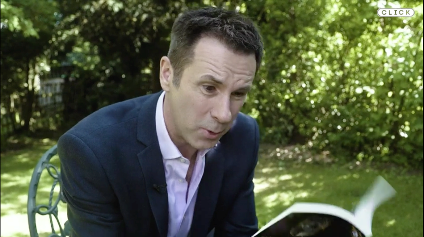
BBC Click used StoryFormer to create their 1000th episode in July 2019, which you can experience at http://www.bbc.co.uk/click1000, and read more about at https://www.bbc.co.uk/news/technology-48867302.
We commissioned Spirit Media to make a personalised factual documentary, “Instagramification”, which launched on BBC Taster. Try it here: https://www.bbc.co.uk/taster/pilots/instagramification
We launched the Origami Frog Makealong on BBC Taster in March 2018. It was a tie in to BBC4/BBC Arts Make! Craft Britain season. You can read about the production process from our perspective https://www.bbc.co.uk/rd/blog/2018-03-make-along-production-object-based-media, and from our partner’s perspective https://www.bbc.co.uk/rd/blog/2018-03-make-along-craft-object-based-media.
Access to StoryFormer is granted by the BBC MakerBox team. If you don’t already have access, request it here: https://www.bbc.co.uk/makerbox/tools/storyformer.
Once you have access, visit https://storyformer.rd.live.tools.bbc.co.uk and log in using your BBC credentials.
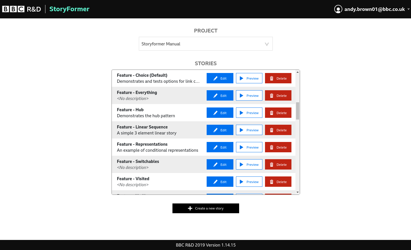
When you log in to StoryFormer, you’ll be taken to the Project Selection screen. You’ll need to select a Project to work in before being able to access or create a Story.
Choose a Project, and you’ll be able to see all the Stories that have been created within it. If it’s a new Project, it will be empty - see Create a new story to learn how to add one.
Projects themselves can only be created by the StoryFormer and MakerBox teams. If there are no Projects in the dropdown, you’ll need to contact the MakerBox team.
Each Story is represented by a row in the Stories table, with the Story name on the left. Edit, Preview and Delete a Story by clicking on the corresponding button in the row:
Clicking Edit will launch StoryFormer with the Editor tab open, ready to work on your Story.
Clicking Preview will launch StoryFormer with the Preview tab open, allowing you to preview and debug your Story.
Clicking Delete will delete the Story. You’ll be asked for confirmation. Once confirmed, your story will be deleted, and will not be recoverable.
Delete won’t delete any Media associated with your Story - this is because Media belongs to a Project, rather than an individual Story.
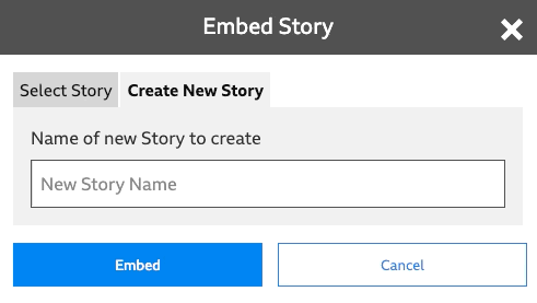
To create a new Story, click Create a new story - the black button beneath the Stories table. A popup will appear, asking you to Add A New Story.
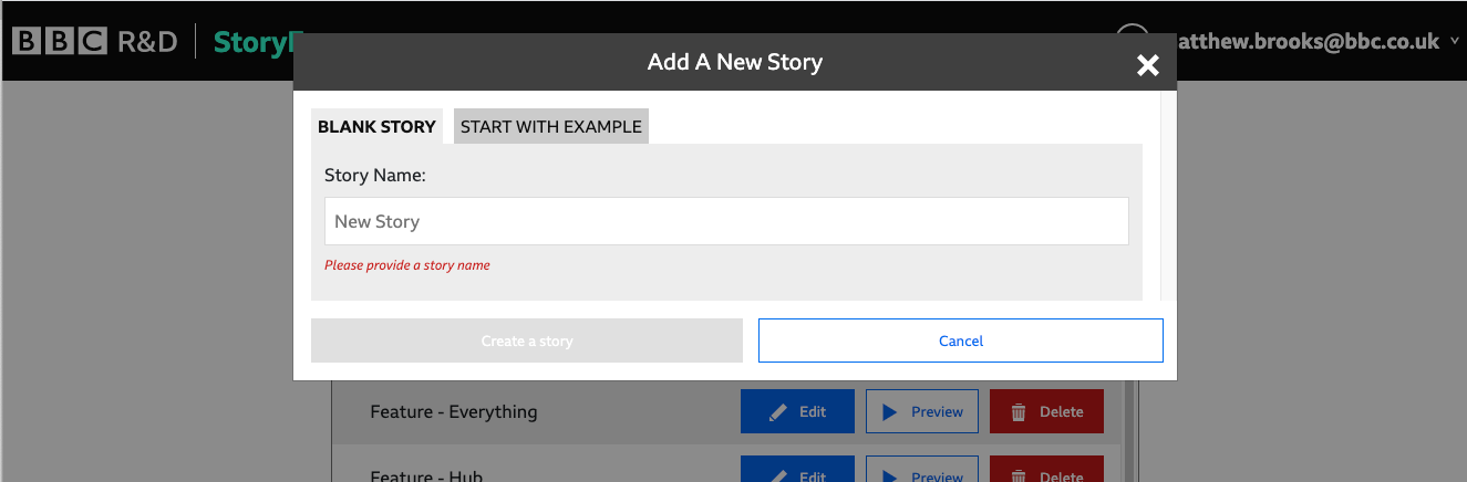
If you’re creating a story from scratch, enter a Story Name, and click Create a story. StoryFormer will create your new story, and take you into the Editor.
Alternatively, if you’d like to start with one of our examples, click START WITH EXAMPLE. You’ll still have to enter a Story Name, but this time you’ll be offered an Example to import dropdown. Click this to choose an example to bring into your Project. Importing an example in this way will copy a whole Story into your project, with all associated Media.
Whichever choice you make, you’ll be taken into the main StoryFormer user interface to work on your Story.
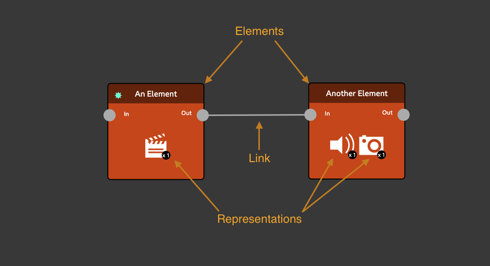
A StoryFormer Story is a collection of Elements, connected together with Links. Each Element holds one or more Representations.
Getting to grips with these concepts is key to understanding what you can build with StoryFormer, and how to go about it.
The Element is the basic building block of every Story in StoryFormer. An Element represents an individual piece of narrative: a scene in a drama, a step in a tutorial, a news article in a bulletin, or a chapter in a documentary.
Elements have an In and Out port, so they can be connected together with Links. Elements also hold one or more Representations.
A Representation holds a piece of media that can be played out for the Element. A Representation has a type, determined by the piece of media it holds - this type will typically be either Video, Audio, or Image. Each Representation in an Element can be considered a different way of presenting the same narrative.
When StoryPlayer reaches an Element, it will play the media from that Element’s Representation. If an Element has more than one Representation, StoryPlayer will use rules that you create to decide which one to play.
The pieces of media assigned to Representations are as long or as short as you need them to be for your purposes. If you are making an interactive or personalised dialog, they might be as short as an individual sentence. If you’re making a tutorial, they will probably be the length of an individual tutorial step.
Links are used to connect the Elements of a Story together, or end the Story. Stories flow from Element to Element, from beginning to end(s), along Links. Stories can even flow into other Stories - this is helpful for managing Story complexity and collaboration.
It’s possible to create a wide variety of story forms using Elements, Representation and Links. Here’s some examples of basic story forms constructed in StoryFormer.
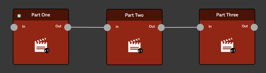
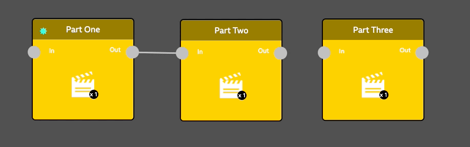
The above StoryFormer screenshot shows how a traditional linear video composition might look.
StoryPlayer will play Part One’s Representation, then move on unconditionally to the next Element, and play Part Two’s Representation. It will then move on unconditionally to Part Three, and play the Representation within that Element. Finally, as the Out port of Part Three isn’t connected to anything, StoryPlayer will stop.
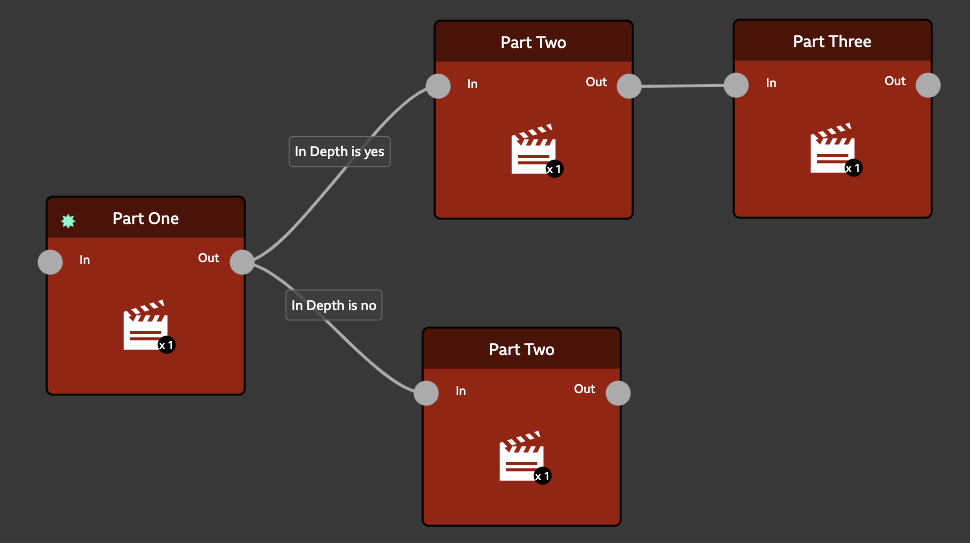
One use of branching might be to describe the same basic story with different amounts of detail. Here, a simple branching story is shown, with each Element again containing a single Representation. However, after Part One, the Story can proceed down two different Links. Where does StoryPlayer go next?
Looking at the screenshot, you can see some boxes drawn over the Links. These boxes represent Variables and Conditions, which are described later on in the manual. StoryPlayer uses these to decide where to go next.
The effect of these Variables and Conditions is that if the viewer wants an In Depth story, StoryPlayer will proceed to Part Two, then Part Three, and then finish. If the viewer has done the opposite, StoryPlayer will proceed to Part Two, and then finish.
Each Element in a StoryFormer story can hold any number of different Representations. In the example Story below, each Element contains one audio-visual Representation (indicated by the clapperboard icon and ‘x1’ subscript) and one audio Representation (indicated by the speaker icon and ‘x1’ subscript).
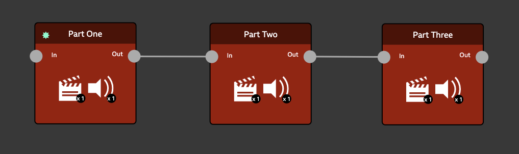
Each Element follows the next, so this is a linear experience. A Variable holds the audience member’s desire for an audio-visual experience or an audio only one. In the Branching Story, we used a Variable to determine which Link to take. Here, we use a Variable to choose which Representation to play. The use of Variables to choose Representations isn’t visible on the canvas, but is authored in The Inspector, which is introduced shortly.
StoryFormer Stories are always contained within a Project. A Project is a collection of media, one or more Stories that use that media, and a list of users who can access the Project.
Any number of users can be granted simultaneous access to a Project - so if you’re working with other people on a StoryFormer experience, you’ll all want access to the same Project.
Because Media belongs to Projects, all Stories in a Project can use all pieces of media in the Project.
Stories can also link to other Stories in the same Project. A typical use of this might be to have a separate Story for each chapter of your experience, and a master Story that is built from those chapters.
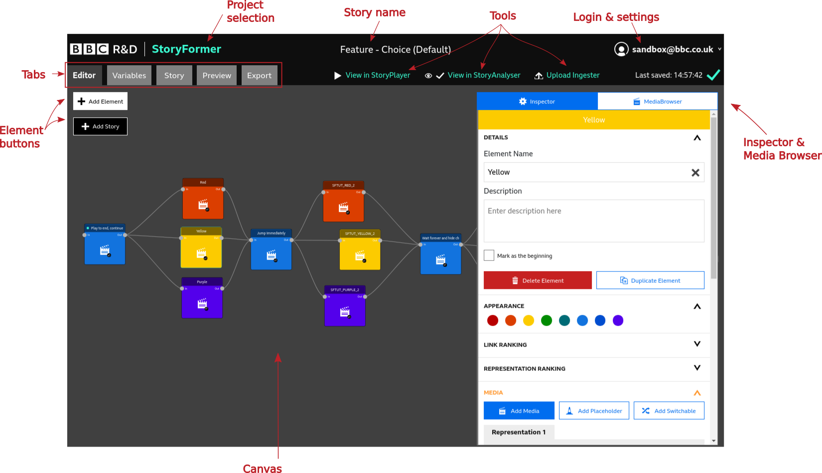
On creating or editing a Story, you’ll be presented with the StoryFormer user interface (UI). This is where you will build your Story. The interface is split into several areas, described below:
Clicking here will take you back to the Project Selection screen.
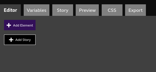
The Editor tab is where you’ll spend most of your time in StoryFormer. The Editor itself contains the Canvas, Element Buttons, Inspector and Media Browser. The functionality of the Editor is introduced in Creating an Element.
Part of the Editor tab, the Canvas shows the Elements and Links in your Story.
Part of the Editor tab, these buttons are used to add Elements and Stories to the Canvas.
Part of the Editor tab, these panels are discussed in The Inspector and The Media Browser.
Define variables for your Story. Discussed in Adding Variables.
Edit Story metadata. Discussed in StoryFormer: Story Tab.
Preview your Story, alongside useful information. Discussed in Preview.
Style the user interface. Discussed in StoryFormer - CSS Tab.
Export your Stories. Discussed in Export Tab.
Shows the name of the Story you’re working on. Stories can be renamed in the Story Tab.
StoryFormer is designed to be used in conjunction with three other tools: - Upload Ingester, where you upload media for use in your stories - StoryPlayer, where you can test how audiences will see your stories - StoryAnalyser, which runs a set of tests on your story to check for common errors.
These tools can be accessed by clicking on the links in StoryFormer.
Clicking on View in StoryPlayer will play back your Story in StoryPlayer. Playback here is as the audience will see it, rather than how it appears in StoryFormer’s Preview tab - which contains additional information and controls useful to you as an author.
There’s a StoryPlayer built into the StoryFormer tool to allow you to preview your Stories alongside additional information that’s useful to you as an author. There’s also a link in StoryFormer to an external StoryPlayer - this one shows you your Story as the audience will see it, without that additional information. Ultimately, your published experience will be played out by an instance of StoryPlayer hosted on a website, or with our standalone StoryPlayer application.
Clicking on View in StoryAnalyser will open up a new tab with StoryAnalyser (you will be required to login). StoryAnalyser runs a set of automated tests to produce a report highlighting potential problems with the story. For example, it will tell you if your story is missing a beginning or End Story links, or if any elements are missing media. Note that these tests are not exhaustive and will not pick up all problems, so this is no substitute for comprehensive testing!
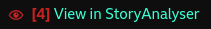
The StoryAnalyser link also contains an indicator so that you can see at a glance if any problems have been detected. A red number displays how many problems have been detected. This updates each time the story is saved.
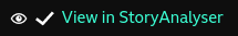
A tick indicates that no problems were found.
Note that problems will be detected as you build the story, but the number should reduce as you near completion and should be 0 before publishing!
Clicking on Upload Ingester will launch the Upload Ingester Tool, where you can upload and manage media for use in StoryFormer.
Clicking Add Element will add an Element to the Canvas. When you add a new Element to the Canvas, it’s automatically selected for you.
Alternatively, you can add an element by dragging media directly from the Media Browser. With the Editor tab open, select the Media Browser tab from the Inspector & Media Browser panel.
Click and drag the media you want to use in the Element, and drop it on the Canvas. An Element will be created for you, with a Representation holding the media you dragged. This drag and drop process can be repeated to add additional Representations to your Element.
For further Media Browser information, check the Media Browser section of this manual.
To create a Narrative Link, hover over the Out port of an Element. It will change colour. Click and drag and a link will appear. Drop it onto the In port of the Element that you want to play next.
When StoryPlayer plays the story shown above, it will play the media in Part One, Part Two and Part Three in sequence, and seamlessly - as if they are one piece of media.
Elements on the canvas can be repositioned by clicking and dragging. The canvas itself can be repositioned by clicking and dragging in empty space. The Canvas can also be zoomed in and out with a mouse wheel or zoom gesture on a trackpad.
As well as Elements, StoryFormer Stories can be built from other Stories. Working in this manner can help manage complexity on the canvas, and also allows multiple people to work together on different parts of a Story simultaneously. Read more in Add Story: Stories within Stories.
To the right of StoryFormer is the Inspector & MediaBrowser panel. Toggle this panel between Inspector and MediaBrowser views by clicking on the respective tabs in the panel. The width of the inspector can be changed by clicking and dragging its left border.
The Inspector allows you to edit the properties of Elements and Links - its contents will change to reflect what you have selected.
The Inspector is split into sections - the screenshot above shows DETAILS, APPEARANCE and MEDIA for a selected Element.
Sections of the Inspector can be expanded or collapsed using the V or inverted V at the top right of each section. With some sections expanded, the Inspector will easily become longer than your browser window, so you’ll need to scroll it up and down to see all of the sections.
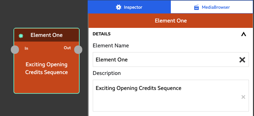
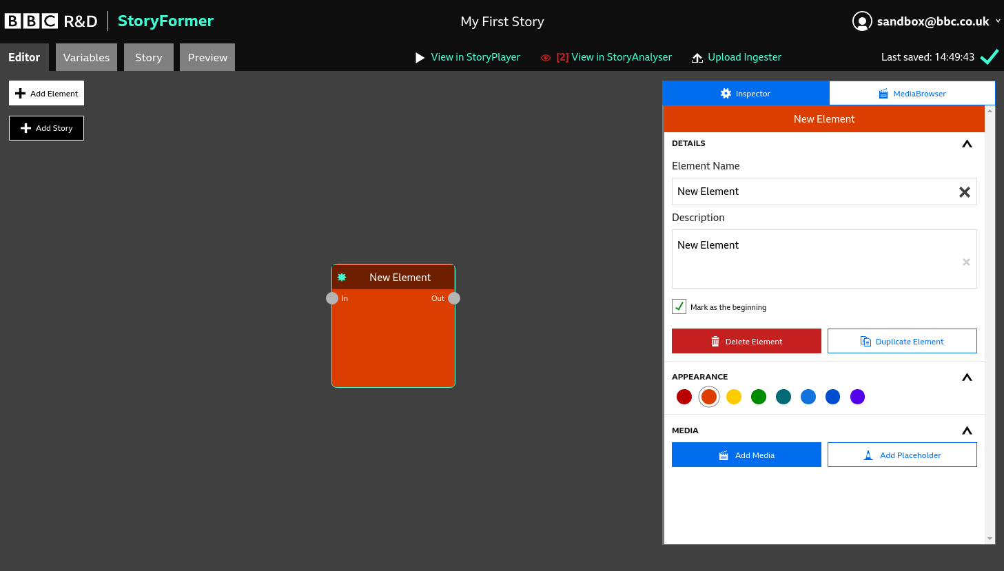
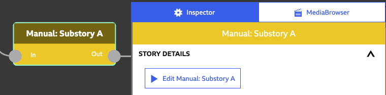
In the above screenshot, we can see a new Element on the Canvas, with the Inspector open to the right. Every Element has a Name, and can have a Description. The Name and Description are not seen by anyone viewing your Story - they exist to help you during the Story authoring process.
In the Inspector, clicking in the Element Name field will allow you to change the name of your Element. Using suitable names for your Elements will allow you to see the flow of your Story from the Canvas. Clicking in the Description textbox will allow you to describe your Element. This can be really useful if you want to sketch out a Story before you’ve acquired any Media for it - just make a note of what you intend the final content to be.
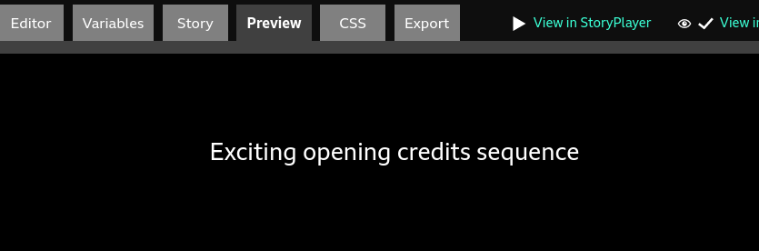
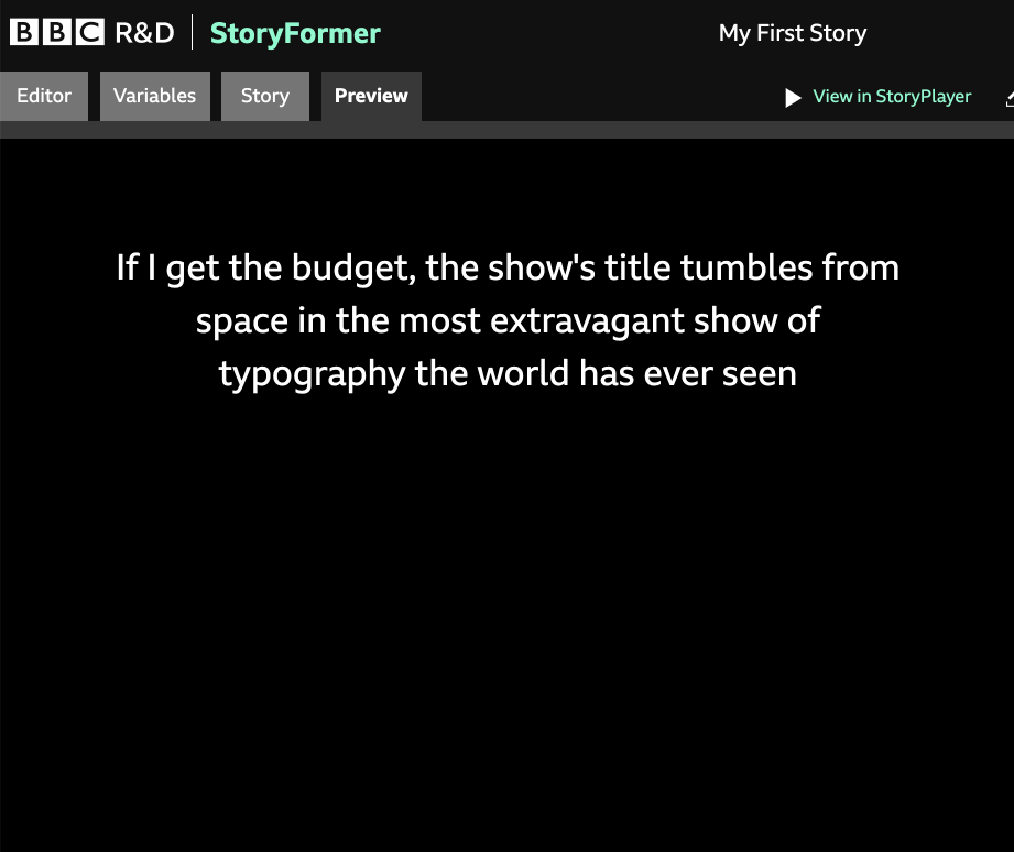
Although Element Name and Description are for your benefit as an author, StoryPlayer will show the contents of Description if you haven’t yet added any Representations to your Element. This can be useful as it allows you to sketch Stories and add interactivity before you’ve ingested any media.
|
|
|
Elements without Representations show their Description in StoryPlayer
Every Story must have a Beginning - without a Beginning, StoryFormer doesn’t know where to start your Story. It’s likely that the first Element you add will be your Beginning. In the Inspector, click the Mark as the beginning checkbox to let StoryFormer know. Don’t worry, if you forget to do this, StoryFormer will remind you.
Clicking Delete Element will remove your Element from the story. Note that this will remove all Links in and out of the Element, which includes any Link Conditions you may have created.
Clicking Duplicate Element will duplicate your Element, adding ‘copy’ to the end of the Element Name, so you can distinguish it from the original.
For authoring convenience, it’s possible to choose a colour for each Element in your story. This allows you to give a simple visual identity to different sequences in your Story, which can help to make the Story more readable on the Canvas.
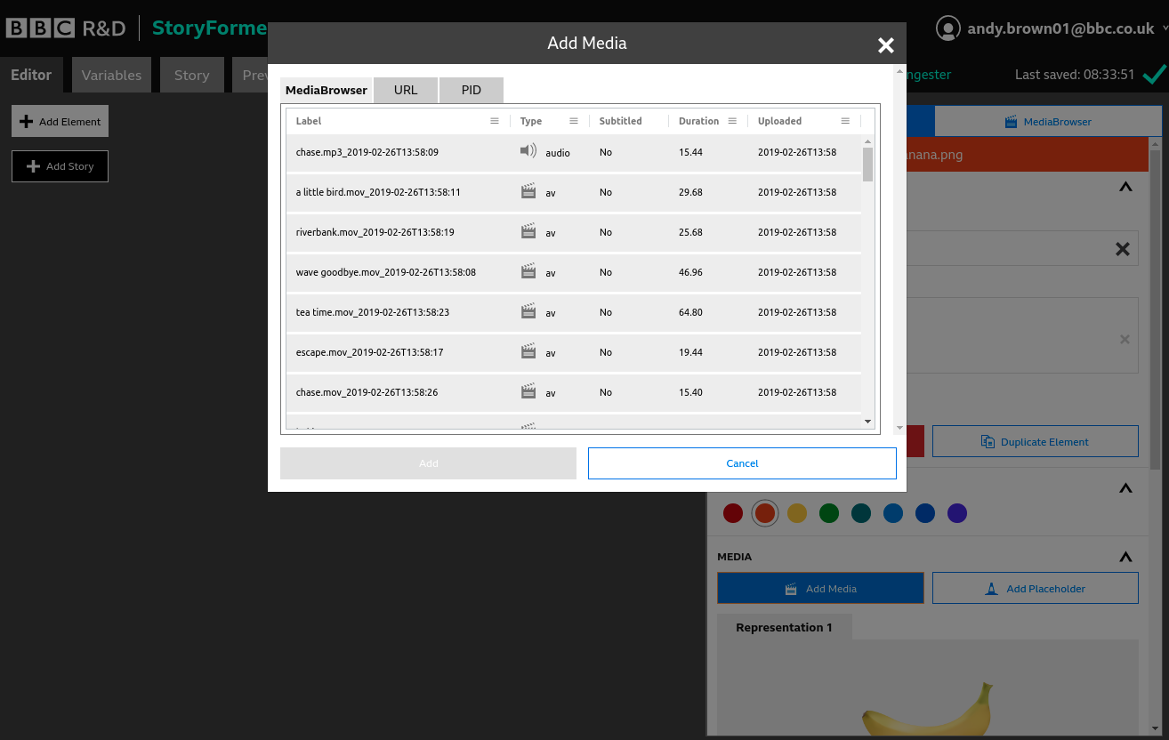
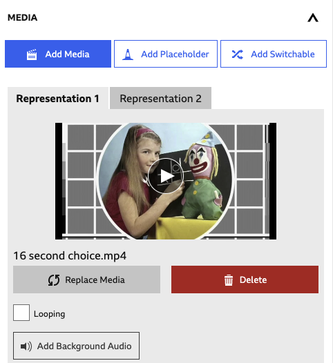
Clicking Add Media will show the Add Media popup. There are two tabs in the popup - MediaBrowser and URL. The popup will launch with the MediaBrowser tab selected.
The Add Media and Add Placeholder buttons can be seen in the bottom right.
This tab operates identically to the MediaBrowser tab in the Inspector & Media Browser panel. Select a piece of Media that you want to use in the currently selected Element, and click Add.
The URL tab allows you to use media that are addressable through a URL - a web address. Select what type of media the URL is (audio, video or image). Give a name to your asset - the web URL may not be particularly representative of the content, so you may prefer something more human readable. Enter the full path to the hosted media source file. Finally, click Add.
Adding media of any type creates a Representation. Every Element in your story can hold one or more Representations. You can choose which Representation is played, and add different behaviours to each of them. Read more in the section on Representations.
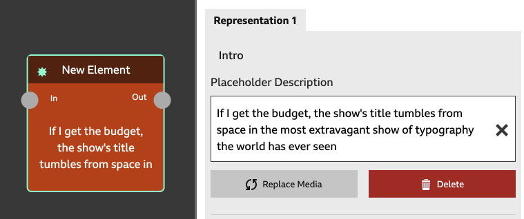
Clicking Add Placeholder will show the “Add Placeholder” popup. A Placeholder is another Representation type (alongside Audio, Video, Image, etc). It’s intended to be used during Story development, where you may have an idea of what your media content will be, but you don’t have it yet.
Add a name for your Placeholder, and a description, then click Add. You’ll immediately see your Placeholder added - it will be shown in a numbered Representation tab.
This has a similar effect as StoryPlayer showing the Element Description for elements without a Representation, except that using Placeholder Representations allows you to have multiple Placeholders in an Element. So, if you have an Element that, for example, will ultimately show an image Representation or a video Representation, you can construct Placeholder Representations for each, and use Conditions to choose which is shown.
|
|
|
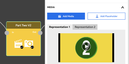
Each Representation in an Element lives in its own tab. Providing an Element has a piece of Media or a Placeholder attached, you will see one or more Representation tabs below the Add Placeholder and Add Media buttons.
To determine which Representation is shown to the viewer, Variables and Conditions are used, which we’ll come to later in the manual.
Within each Representation Tab, you’ll find the following functionality:
Clicking Replace Media will launch a Select Media popup, allowing you to swap out the media for your Representation with another piece of Media.
This is a feature that will only show in StoryFormer if you’ve enabled it using Enabled Features.
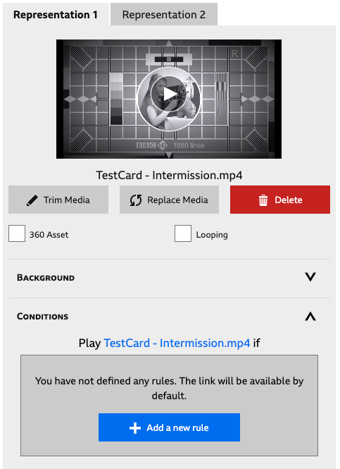
The Trim Media button allows you to set In and Out points for video Representations. Clicking Trim Media will launch the Media Trimmer popup.
The Media Trimmer contains a filmstrip control, seen above in grey. The green bars in the filmstrip represent the In and Out points of your media clip - StoryPlayer will play everything between these green bars.
To set the In and Out points, drag the green bars with the mouse. Hovering over the filmstrip with the mouse will show a vertical white playhead - the main video should update to follow this, although it can be a little slow to respond.
To preview what StoryPlayer will play, click the Preview button. If you want to reset the markers back to the full clip length, click Reset Markers.
StoryFormer doesn’t currently generate thumbnails automatically - but it is possible to populate the empty grey filmstrip with thumbnails generated by the application. Click Generate Thumbnails to start this process. As you drag the In and Out points, or hover over the strip, the thumbnails will update to show you the content under the mouse pointer.
If you’d like more fidelity editing your In and Out points, the Zoom control will show more thumbnails, which allows you to pick more accurately. The frames of your video are spread over up to four rows, with the end of the first row continuing to the start of the second, and so on.
This will delete the Representation from the Element. You’ll be asked to confirm this operation.
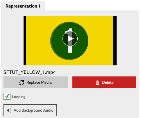
Selecting this will loop any time-based media in the Representation. StoryPlayer will not proceed on to the next Element unless the Next button is pressed, or a Choice is made by the viewer.
StoryFormer allows you to author simple background audio that runs under your Representations. To attach background audio to a Representation, click Add Background Audio, select some audio from the popup, and click Add to close the popup.
To learn how Background Audio behaves - how you can start, stop and change what’s playing throughout your Story, see Background Audio Rules.
StoryFormer allows you to illustrate audio Representations with an image, so you can illustrate an audio-driven story. While your audio Representation is being played, the background image will be shown.
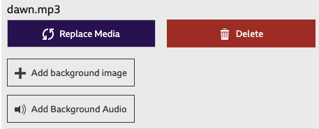
To add a background image, click Add Background Image and select your image from the MediaBrowser popup. Close the popup to see your background image in the Inspector.
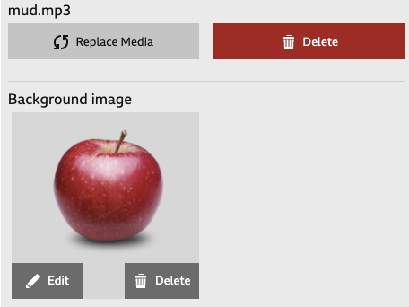
Change your image by clicking Edit, and remove your background image by clicking Delete.
Variables are one of the two primary mechanisms StoryFormer has for controlling flow through a Story (the other being Link Choices). You can use Variables to hold some information that the viewer has given you, and use that information over and over again throughout your Story.
Variables can be used to change which Links are taken by StoryPlayer when leaving an Element, as well as which Representations are shown in Elements. A Variable can be used in this way as many times as you like in a Story, wherever you’d like to use it. Variables can also be used in combination with each other to build more complex Story flow.
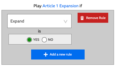
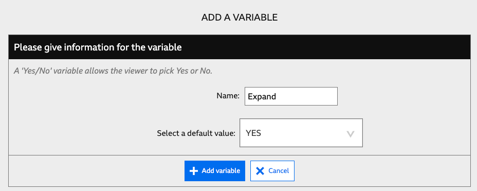
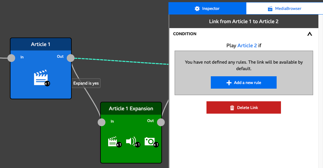
For example, let’s imagine you were creating a flexible news bulletin with optional expanded sections that give the viewer more detail. You could achieve this by creating a Variable called “Expand”, which the viewer sets to “Yes” or “No” at the start of the bulletin.
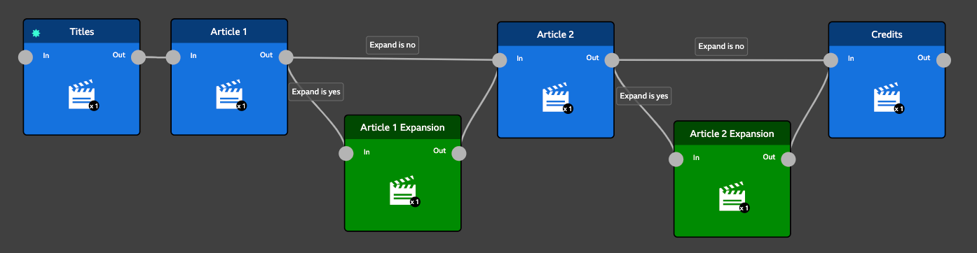
In the above screenshot, the variable “Expand” is used twice in the Story. First, StoryPlayer will show Titles, then Article 1. If Expand is yes, StoryPlayer shows “Article 1 Expansion” before showing “Article 2”. If Expand is no, StoryPlayer continues directly to “Article 2”. The same kind of flow is present to control whether “Article 2 Expansion” is shown.
Using a Variable rather than a Choice allows you to remember a decision on the part of the viewer, and use that decision over and over again.
Because Choices are immediate and transient, once a choice has been made by the viewer, the Story moves on to the corresponding Element, and the Link Choice is forgotten*. The viewer’s decision cannot be directly recalled for use further on in the story. Building “Expandable News” with Choices would require you to author a Choice for every news article, would require the viewer to lean forwards and choose Expand every single time.
To use Variables, you will first add them to your Story and define what type they are and what values they can have. Then you’ll put them to use in Link Conditions and Representation Conditions.
Having Variables in your Story will not have any effect until you’ve used them in a Condition inside either a Link or a Representation.
* Although StoryPlayer doesn’t remember Choices, similar functionality can be achieved using the built-in Visited variable.
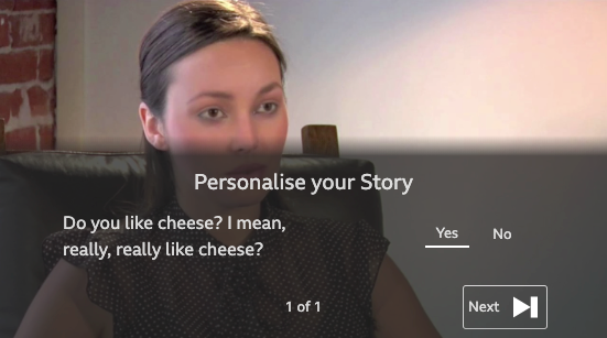
YES/NO Variables hold either the value YES, or the value NO. For example, you could create a YES/NO Variable called “Likes Cheese”.
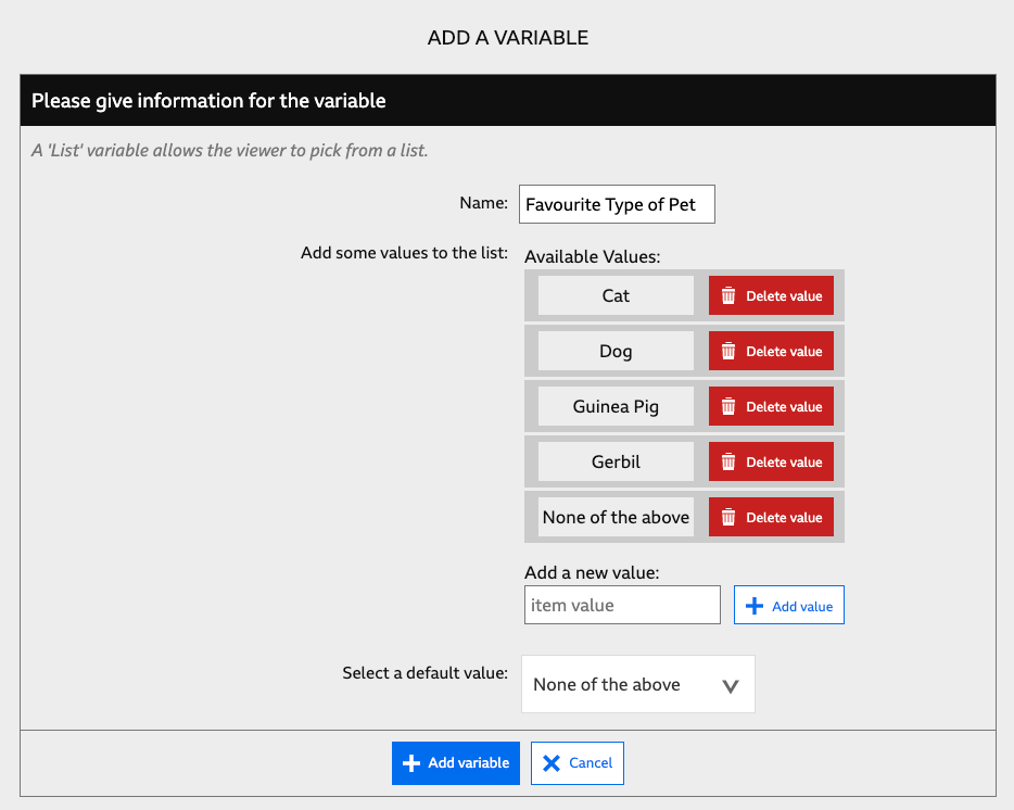
List Variables allow the viewer to pick a single choice from a list, which you define. For example, you could create a Variable called “Favourite Type of Pet”, with values “Cat”, “Dog”, “Guinea Pig”, “Gerbil”, “None of the above”.
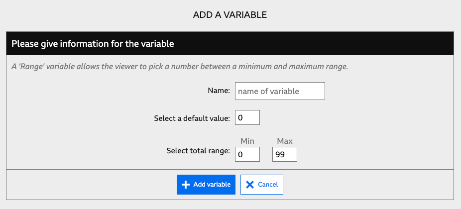
This type of Variable allows the viewer to pick a number from a range you define. For example, you could create a variable called “Age”, with range 1 to 99.
To create Variables, click the Variables tab (next to the Editor tab in the top left of StoryFormer). The Variables tab is split into two panes. Use the left hand side to add new variables, and the right hand side to edit and delete existing variables.
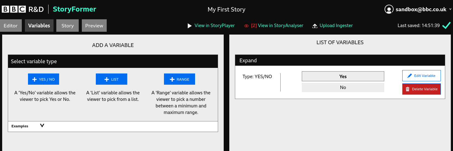
Click +YES/NO to select this variable type, name your Variable, set a default value, then click Add Variable to create it.
Clicked +LIST, name your variable, and add values to your list - typing each value in turn into the Add a new value box, and clicking the Add value button.
Your values will be shown as you add them - you can keep adding more, or delete any you’re not happy with using the Delete value button. Once you’ve added all your values, select a default value for the Variable from the list values you’ve created.
Click +RANGE, name your variable, enter a default value, and enter the range allowed from Min to Max.
Note: This is a dangerous feature and you will need to change your Enabled Features to be able to use it (this feature will be available if you set yourself as “Expert”).
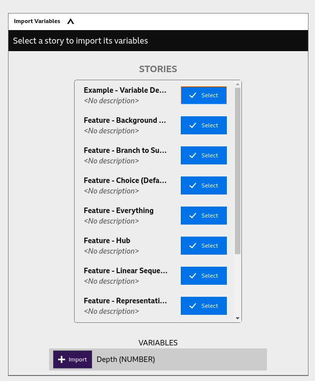
It is also possible to import variables from another story. To do this, open up the Import Variables section in the left hand pane. You will be shown a list of the stories in the current project; identify the one containing the variable you wish to copy and click the Select button. This will show you a list of all the variables in that story; these are shown below the list of stories. Choose the variable you wish to import and click the Import button; this will copy the variable and add it to the list in the right pane. This variable will now be available to use when authoring conditions.
This facility can be useful if you want to use the same set of variables across one or more sub-stories. There are two important things to remember:
The best way to approach this kind of scenario is to scope your variable definitions: if a variable is only used in one story then define it there; if a variable is going to be used in multiple places then define it in the parent story and import into any substories that need it.
It is very important to note that editing variables after they have been imported is likely to cause problems. This is because importating a variable only copies it, so changing the variable in one story may lead you to have conflicting definitions, thus being able to author conditions that are wrong. Also, do not forget that deleting a variable in a story will remove any conditions that reference that variable. You should therefore try to decide what variables you are going to need, what attributes they will have and where they will be needed before defining and importing them.
Every Variable you add requires a Default Value. The Variable will be initialised with this value before the Story begins. If you don’t use a Variable Panel to collect a value for your Variable, it will remain set to the Default Value throughout your Story.
Existing Variables are listed in the right hand pane of the Variables tab. Click Edit Variable to make changes to your variable. You cannot rename a variable, only edit or delete it.
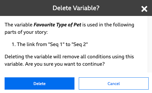
Deleting Variables will have implications across your story, as Variables are used in Link Conditions and Representation Conditions. StoryFormer will show a popup telling you where your variable is in use before you delete it. If you click Confirm, StoryFormer will delete all Conditions (Link and Representation) that use your variable. Click Cancel to back out.
It’s possible to perform simple operations on variables during playback of the story. Manipulations can be performed either during a representation or at its end. The following operations can be performed:
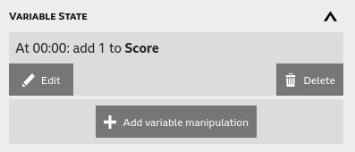
To manipulate a variable like this, use the Inspector to find the Representation in which you want to add the manipulation. You’ll see a Variable State section in the Representation. Expand this section, and hit ‘Add variable manipulation’.
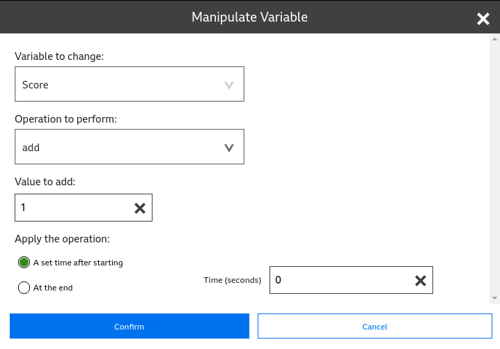
This will launch the Add Variable Manipulation popup. Choose the variable you’d like to change, and the operation you would like to perform. If appropriate, set the value you’d like to use (e.g., the number to add, or the value to set the variable to). Finally, decide when you want to apply the operation - a set time after the Representation has started, or at the end. Hit Confirm to finish adding the variable manipulation, and you’re done.
To edit your manipulation, head back to the Representation’s Variable State section in the Inspector, and hit the Edit button. You can add further manipulations here too.
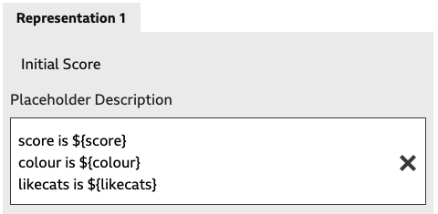
It’s possible to show the current value of variables in Elements that have no Representations, and Placeholder Representations. This functionality is really designed for you to check how your variable manipulation is working, rather than be used to display a variable in a finished experience.
Variables are displayed using a special syntax that’s entered in either the Description field of Elements with no Representations, or the Placeholder Description field of Elements with Placeholder Representations.
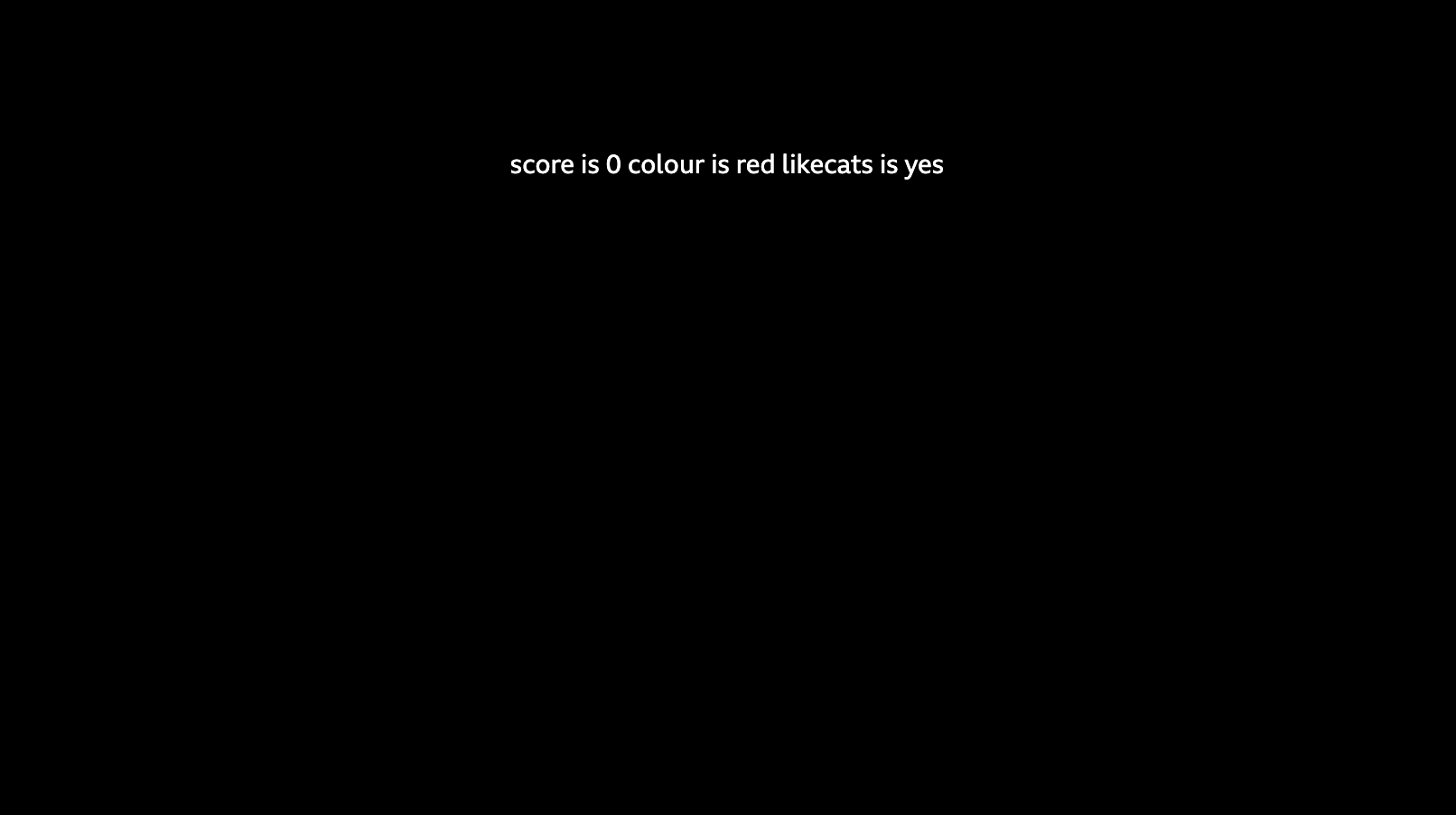
To show your Variable, use the syntax ‘${variablename}’ in the Description/Placeholder Description field wherever you want that variable to be shown.
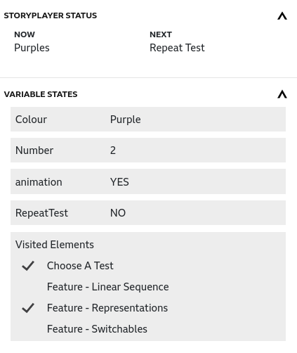
In the example below, we have a Range variable score, a List variable colour, and a yes/no variable likecats. You can see how those variables get displayed below - basic, but useful.
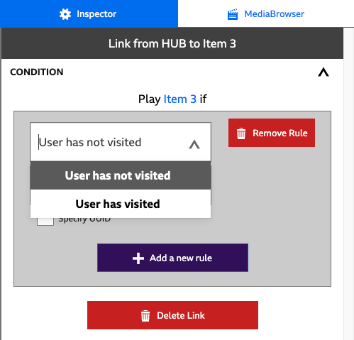
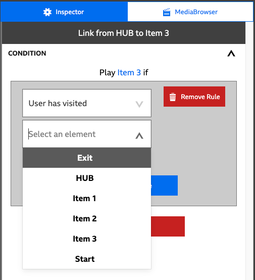
Visited is a built-in Variable that StoryPlayer maintains. It holds a list of all Elements the viewer has visited since the beginning of the Story. You can use it in Conditions to check whether the viewer has visited an Element, or not.
|
|
|
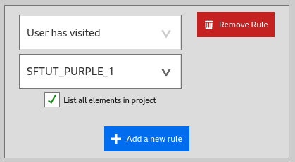
Visited shows up in the Variable selector as “User has visited” and “User has not visited”.
To check Visited, select either option from the Variable selector, and select the element you want to check from the Element selector.
A simple example of Visited in use can be seen in Link Choices, Conditions and Visited.
Adding a Variable to your Story allows you to use that Variable to control which Link is taken in the event your Element is connected to more than one other Element. It also allows you to control which particular Representation is shown in the event your Element has more than one Representation.
However, creating a Variable does not automatically create a way for the viewer to set the Variable. To get values for your Variables from the viewer, you need to create a place where you can ask the viewer for input - this is called a Variable Panel.
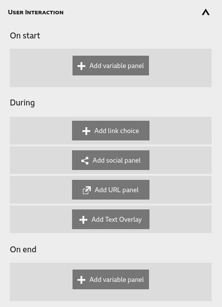
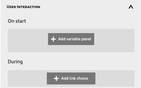
The Variable Panel is shown to the viewer either at the start or the end of a Representation. Like Link Choices, Variable Panels are created and edited in the User Interaction panel of a Representation.
Variable Panels can be added at the start of the Representation’s media, or the end.
A Variable Panel can be used to collect values for one or more of your Variables at the same time. You can show a Variable Panel at the start of a Representation, or at the end.
It’s up to you whether you want to collect values for all of your Variables before your Story starts, or you want to collect them at various points in your Story.
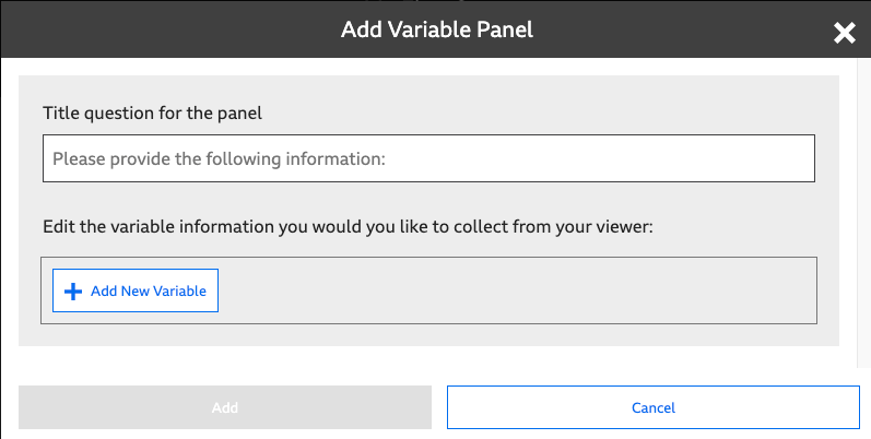
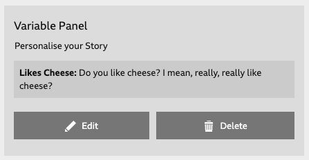
Click on Add variable panel in the On start or On end section of the Representation tab to launch the “Create Variable Panel” popup.
Supply a Title question for the panel - this will be shown above every question the viewer is asked. Then, click Add New Variable to add a Variable to the Variable Panel. Choose which Variable you want to collect from the Variable: dropdown. Fill in the Question: with text that will be shown to the viewer. Then, click the Add button to finish adding your first Variable to the Variable Panel.
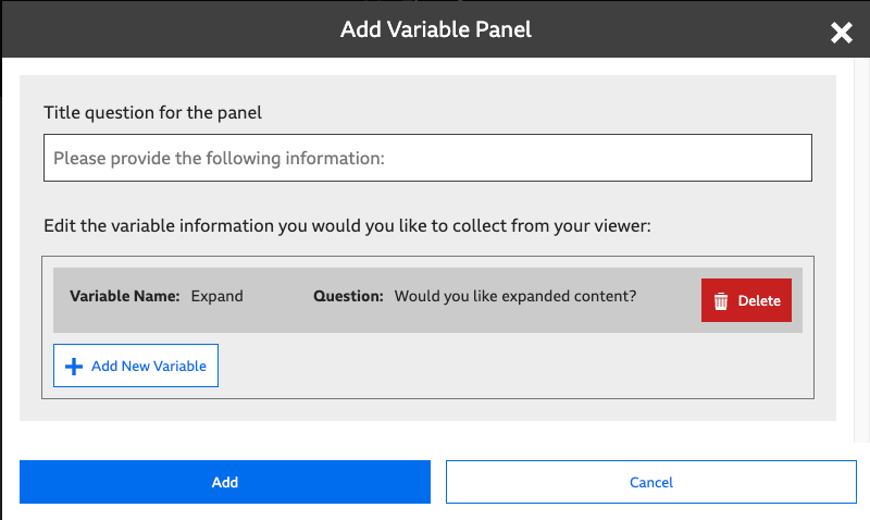
The Popup will now look something like the above screenshot. From here, you can click Add New Variable to add another one to your Panel - maybe you want to ask them all in one go, in which case keep adding until you’ve added all of your Variables. You can always click Delete Variable if you’ve changed your mind, to delete a particular question from the Panel.
Once you are happy that your Panel asks for all the Variables you want to collect - click Create Panel. The popup will close, and you’ll see that the Inspector now shows your Variables Panel in the User Interaction section of the Representation tab.
If you want to alter your panel, click the Edit button. Delete will delete your panel.
It’s perfectly fine to use a Variable in a Link Condition or Representation Condition before you’ve collected it using a Variable Panel - it will be set to that Variable’s Default Value.
It’s not possible to use a Variable Panel to influence which Representation is shown in the same Element as the Variable Panel. When a Variable Panel is shown, the Representation for the Element has already been chosen.
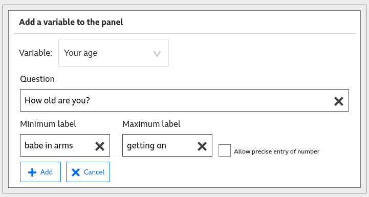
There are some extra subtleties around using range values in a variables panel. In some circumstances you might want the user to give an exact value, in others a rough indication on a scale might be enough. You can achieve either of these using the variable panel, and the key is how you use the minimum and maximum labels. The default settings will populate these with the minimum and maximum allowable values for the variable:
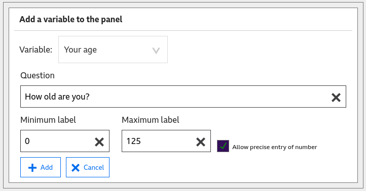
The panel will then present the user with a slider to set between these two values. If a slider might not allow sufficiently precise entry of the value (e.g., you need an exact age), ticking the “Allow precise entry of number” checkbox will present an addional input to the user for typing in the number.
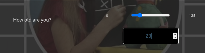
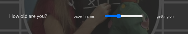
If, however, the variable is a number that is essentially arbitrary and only used for story logic, you can hide its values from the users. An example of this might be to present a Likert scale where you want someone to place the slider somewhere on a scale of ‘Agree strongly’ to ‘Disagree strongly’. This can be achieved by editing the minimum and maximum labels. In our age example, you might not really care about the exact age, so could set the labels accordingly:
These would then indicate to the user that the precise position of the slider really isn’t that important:
Links are used to control the flows of the story: Narrative Links allow one Element to follow another; End Story Links force the Story to end.
To create a Narrative Link, hover over the Out port of an Element. It will change colour. Click and drag and a link will appear. Drop it onto the In port of the Element that you want to play next.
When StoryPlayer plays the story shown above, it will play the media in Part One, Part Two and Part Three in sequence, and seamlessly - as if they are one piece of media.
Creating an End Story link is very similar to creating a Narrative Link. To create an End Story Link, hover over the Out port of an Element. It will change colour. Click and drag and a Narrative Link will appear. Press and hold shift to change the link to an End Story Link. Drop it on any empty area of the canvas to end the Story after that Element.
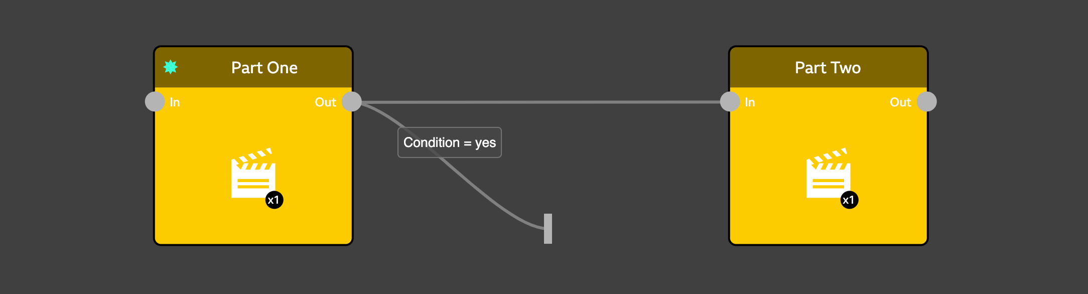
When StoryPlayer plays the story shown above, it will play the media in Part One, and then: end the Story if the Condition evaluates to true; otherwise play Part Two.
End story links are most useful when you want to exit a story early based on complicated conditons. To learn more see Conditions with Links.
A Link Choice in StoryFormer allows the viewer to choose which Link they want to follow at the end of an Element.
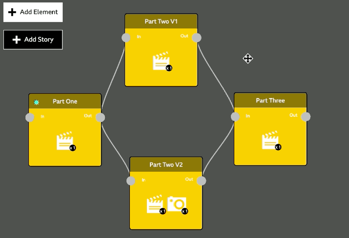
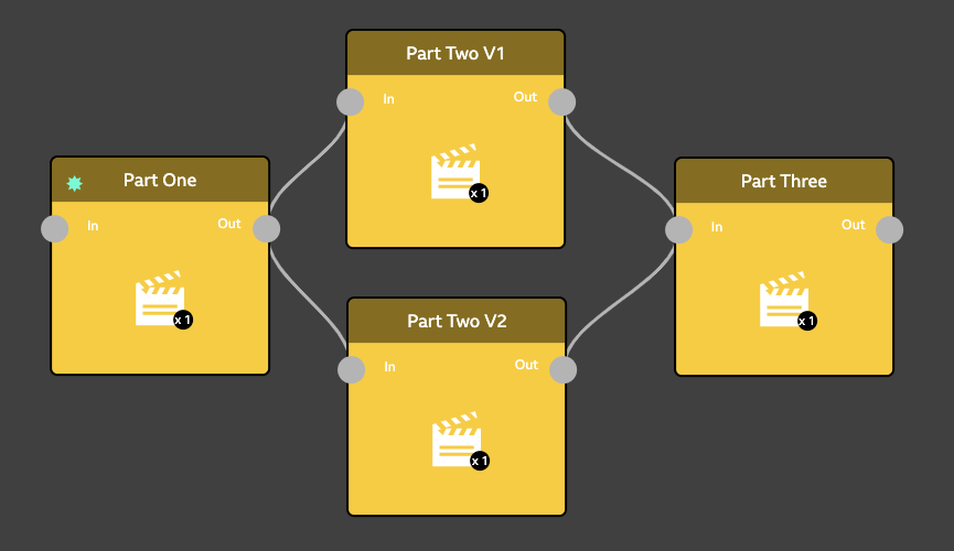
In the following screenshot, the author’s intention is that the viewer makes a choice in Part One that determines whether they see Part Two V1 or Part Two V2. However, linking Part One to Part Two V1 and Part Two V2 doesn’t give StoryPlayer enough information to create a user interface for the viewer - for that, we have to explicitly create a Choice in the Part One Element.
(To learn about what happens if you have more than one Link out from an Element and you don’t add a Link Choice, check out Link Rankings and Variables.)
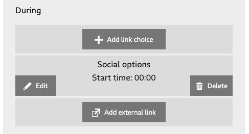
To add a Choice, click on the Element in which you want the choice to appear. In the above example, you would first select the “Part One” Element. Scroll down in the Inspector and select the Representation that you want to add a Choice to. Look for the User Interaction section, and click Add link choice to launch the Add Link Choice popup. If you’ve already added a Link Choice, you can choose to Edit or Delete your choice.
Note: if you have multiple Representations in an Element, you will need to add User Interactions for each Representation.
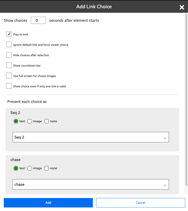
There are many options that can be set for Link Choices:
The choices will be shown N seconds after the media in the Representation start playing. It’s likely that you’ll set this some time into the Media, perhaps a short time from the end.
This option is selected by default. Once a Choice has been selected by the viewer, the Representation is allowed to play out before the appropriate link is taken. Unchecking this option means that StoryPlayer will follow the link the instant it’s clicked on by the viewer, and truncate the media playing out in the Representation containing the Choice.
In the event of not getting any interaction from the viewer, StoryPlayer will choose the default link on the viewer’s behalf, and continue with the Story. Checking this option will wait for the viewer to make a choice, even if the Representation’s media runs out. For more on default links, check the section on Default Links.
Without this option selected, the viewer is allowed to select and reselect Choices until the Representation is finished. Selecting this option will make the choices disappear once one has been selected by the viewer, making their decision irreversible.
Show a shrinking countdown bar from the moment the Choices are displayed through to the end of this Representation’s Media
The default display for Choices is in the lower third of the screen. In the event that you are using images to represent Choices, selecting this option will tile the whole screen with those Choices.
If there is only one valid Link out from an Element (see Variables), StoryPlayer’s default behaviour is to follow that Link. If a Link Choice is present, it won’t be displayed.
Selecting this option will force StoryPlayer to display a single Link Choice in these circumstances. This is useful if you want to offer the option of skipping out of the current Element with a Choice. The skip forward button is a leap into the dark, but a Choice gives you the opportunity to tell the viewer something about their destination, and give more permission.
When you initially create a Choice, this section of the popup will be populated with options for each of the outgoing Links from the Element. They’ll all be set to show Text, and the Text will be set to the name of the Element at the end of each outgoing Link.
You can edit this Text to change the on-screen prompt for the viewer. You can also choose to use an image, rather than text, or hide the prompt by choosing None.
It’s possible to hide the Choice entirely by choosing None. Hiding a Choice may seem surprising, but this can be combined with Default Links to create a Story that automatically follows a default path without interaction, offering extra content as a single Choice.
Every Element that is connected through the OUT port to more than one Element will have a Default Link. StoryPlayer uses Default Links to resolve where to go next when it’s unclear.
Setting the Default Link is discussed in Link Rankings. You will first need to enable Link Rankings in the StoryFormer interface, using Enabled Features.
Default Links are useful when you want your Story to continue to play, even if the viewer doesn’t make a choice. In the situation where Choices are being shown, but the viewer doesn’t click on one before the media ends, the Default Link will be taken.
You can see which Choice corresponds to the Default Link, as it is shown with a grey underline before any choice is made by the viewer.
This behaviour can be suppressed by selecting Ignore default link and force user choice - in which case StoryPlayer will wait indefinitely for the viewer to make a choice, even if the Element’s media has ended. Video Representations will hold their last frame in this situation. Audio Representations will stop playing once they run out of media.
By using Default Links, you can ensure your Story plays out without stopping, regardless of whether the viewer interacts with it. This behaviour is great for Stories that need to flow continuously. For other Stories like step-by-step tutorials, you may not want to use Default Links. Setting Ignore default link and force viewer choice in each of your Link Choices will ensure they’re not used.
There are other situations in which StoryPlayer will use Default Links. You may connect an Element to two others but not specify Link Choices or Link Conditions. StoryPlayer will take the Default Link here too. This is perfectly valid, but probably only likely to happen during story development, rather than by design.
This is a feature that will only show in StoryFormer if you’ve enabled it using Enabled Features.
Link Rankings are used to control two aspects of the way StoryPlayer handles and presents Choices. They are used to order Choices in the StoryPlayer interface, and they are used to determine which Link is the Default Link. To change Link Rankings, click and drag the Links up or down in the Link Ranking section of the Inspector.
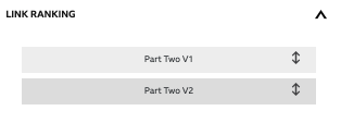
To control the ordering of Choices in an Element, drag the Links into the order you want. The Choices will be displayed with the top ranked link on the left of the screen, with subsequent Choices following the Link Ranking ordering.
The above screenshot of Link Rankings will result in the ‘Part Two V1’ Choice being displayed on the left, and the ‘Part Two V2’ Choice being displayed on the right.
The Default Link for an Element is the highest valid link shown in the Element’s link ranking. This will usually be the top link - but if you have Conditions attached to your links that may evaluate to false, the Default Link may be further down the Link Ranking table.
Conditions are used with both Links and Representations. Conditions on Links use Variables to control which Link is taken from an Element, and Conditions on Representations control which Representation is shown for an Element. No matter whether you’re adding a Condition to a Link or a Representation, the process for creating the condition is the same.
To add a Condition to a Link, click on the Link in the Editor. This will show the Link details in the Inspector.
Click Add a new rule, and select the Variable from the dropdown. The Link Inspector will change to offer you different options depending on the type of your Variable.
|
|
|
|
Setting up new Rules within a Condition
Once you’ve created your condition, it’s edited in exactly the same way. You can remove a rule from a Condition with the Remove Rule button.
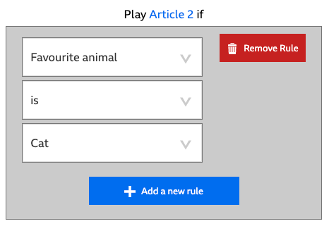
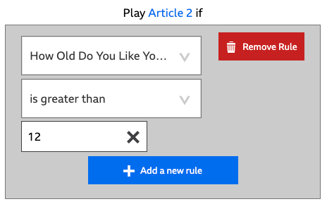
If you want to check more than one Variable in a Link Condition, click Add a new rule again, and repeat the above process with a different Variable from your story. Once you’ve finished adding your new Rule, the Link Inspector will add a border around your Conditions, indicating that they will be evaluated together, and add a new option, All/Any of the conditions are fulfilled.
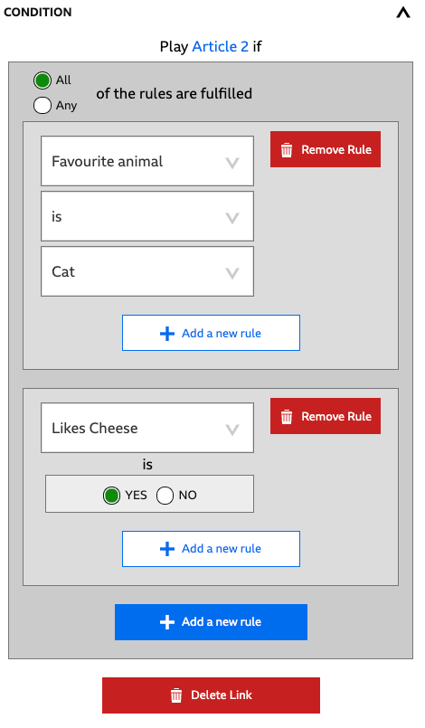
Setting All, as in the above screenshot, means that Article 2 can be played only if all of the rules are true (your favourite animal is Cat, and you like cheese). If Any were chosen, Article 2 can be played if any of the rules are true (you love cats, or you like cheese, or both).
What if you wanted to target all of the cheese lovers that had either a cat or a dog? You can do this too, by nesting rules. What we want to accomplish is to play Article 2 if (favorite is cat or favorite is dog) and (likes cheese is yes)”. Clicking Add a new rule inside an existing rule will allow you to do this. Fill in the new rule you would like to add within an existing rule, and then decide whether you want All or Any of the rules met. For our example, it doesn’t matter whether the favorite is a cat or a dog, as long as it’s one or the other, so Any is the right choice.
There are some subtle interactions between Conditions and Link Rankings that you need to be aware of. They enable a lot of interesting behaviours and authoring shortcuts - but if you’re not aware of these interactions, you may be caught out by them! The following walk through will help you understand what these interactions are, so you can use them to your advantage.
Let’s walk through what happens when an Element’s Out port is connected to more than one In port. In this situation, StoryPlayer decides which Element to visit next based on Link Ranking and Conditions, using the following rules:
StoryPlayer will examine each link from the highest ranking to the lowest, and take the first link it finds that evaluates to true.
Links with no attached conditions always evaluate to true.
Links with attached conditions will only be taken if the condition evaluates to true.
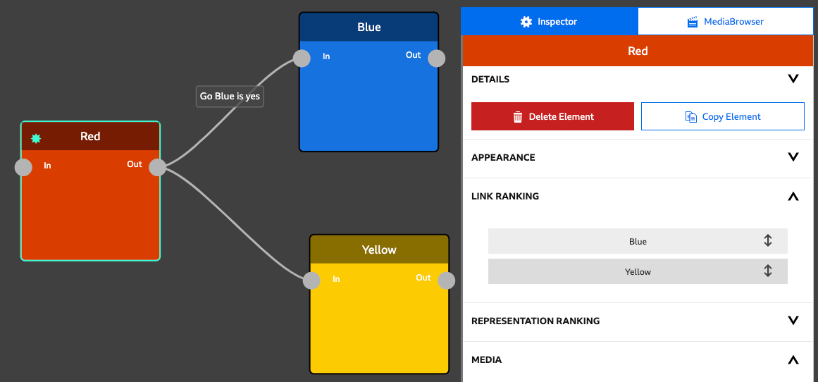
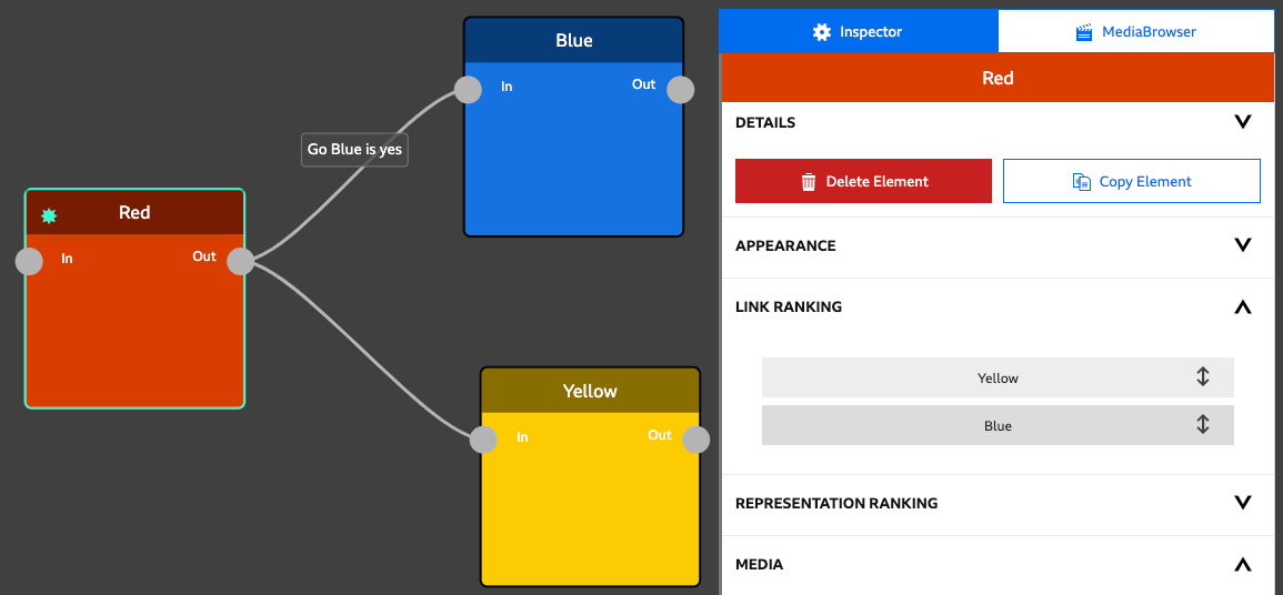
The Link to Blue has a Condition attached -
‘Play Blue if ALL the conditions are fulfilled: GoBlue is Yes’.
In the Link Ranking section for the ‘Red’ Element, the ‘Blue’ link is the highest rank.
Let’s walk through what happens if ‘GoBlue’ is set to ‘YES’.
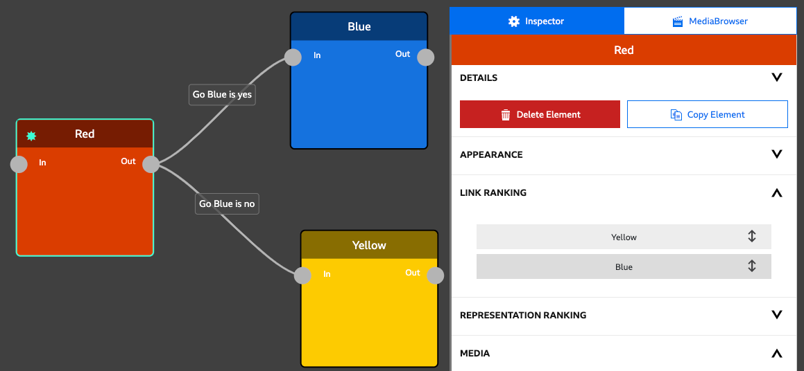
Simple enough! What happens if ‘GoBlue’ is set to ‘NO’
OK, so far so good. Everything works as intended. But what happens if we were to play about with the ranking? Let’s rank Yellow above Blue:
Let’s walk through what happens again. ‘GoBlue’ is still set to ‘YES’.
It doesn’t matter that we have a Condition attached to the link to Blue, because StoryPlayer doesn’t evaluate it. The top ranked link is Yellow, and it has no Condition on it. So, it evaluates to True, and StoryPlayer will take that link.
If you have a link with no attached condition that’s ranked above links with conditions, the link with no attached condition will always be taken
We could fix this situation in one of two ways. Firstly, by putting Blue back at the top of the Link Rankings. Or secondly, by adding a Condition to the link to Yellow:
Now, StoryPlayer can only go to Yellow if GoBlue=NO.
Let’s do the walkthrough. As before, ‘GoBlue’ is still set to ‘YES’
We’ve restored the desired behaviour by adding another Condition. Even though Yellow is our top ranked link, the link to Yellow evaluates to false, so StoryPlayer moves on to check, and take, the link to Blue.
If an Element contains multiple Representations, you will need to use Representation Conditions to select which Representation to show. You can set the conditions in the Conditions section of the Representation tab.
Representation Conditions are defined in exactly the same way as Link Conditions are. Get started by clicking on Add a new rule, which will allow you to select the Variable you want to use to control which of your Representations in your Element is shown to the viewer. For further guidance, head to the Conditions with Links and Complex Conditions sections of this document.
This is a feature that will only show in StoryFormer if you’ve enabled it using Enabled Features.
Representation Rankings are used by StoryPlayer when evaluating Representation Conditions. StoryPlayer evaluates Representation Conditions from the top ranked Representation downwards, in order, and will show the first Representation with a Representation Condition that evaluates to True.
If you have a number of Representations in your Element, it is useful to control the order in which these Representations are evaluated, as it can simplify the logic in your Representation Conditions.
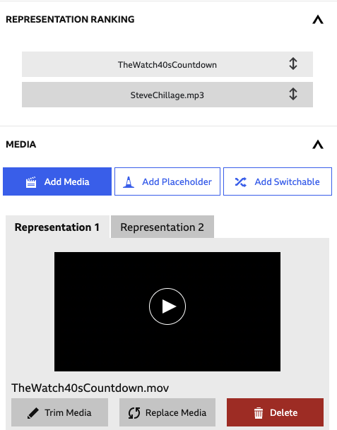
Drag and drop them to rearrange the order.
For example - consider an Element with two Representations - one video, and one audio. Maybe this is an experience which can be watched, or listened to as a podcast. There’s a YES/NO Variable called ‘visuals’ - which is set to YES if the viewer wants to watch, and NO if the viewer wants to listen. In our Element, Representation 1 is video, and Representation 2 is audio.
To achieve the personalisation we’re after, we could attach a Condition to Representation 1 that plays Representation 1 (video) if ‘visuals’ is set to YES, and attach another Condition to Representation 2 that plays Representation 2 (audio) if ‘visuals’ is set to NO. This is a belt and braces approach that will never go wrong, no matter what your Representation rankings are.
However - ensuring the Representations are ranked correctly can save you a bit of authoring time. Remember, StoryPlayer evaluates Representation conditions from the top ranked Representation (Representation 1) downwards, and shows the first Representation it finds that has a Condition that’s true.
In our example, which has video content in Representation 1, if ‘visuals’ is set to YES, StoryPlayer will show Representation 1. It won’t even check Representation 2’s Condition.
This means we don’t need to attach a Condition to Representation 2. If ‘visuals’ is set to NO, StoryPlayer will move on to check Representation 2. A Representation without a Condition is treated in the same way as a Representation with a Condition that’s true - StoryPlayer will play it.
So - in this example, you can attach a Condition to Representation 1, and just leave Representation 2 without one.
It can be quicker to work in this way - but it can bite you! What if you changed the representation rankings now?
If you dragged the audio representation to the top of the rankings, the audio will be in the Representation 1 slot, and the video will be in Representation 2. The audio Representation has no Condition attached, so StoryPlayer will play it. It’ll never check Representation 2’s Condition. Your ‘visited’ variable will effectively be ignored.
To effectively use Conditions in combination with Link and Representation rankings, remember:
StoryFormer allows you to combine Link Choices and Conditions together. This can be used to dynamically alter the selection of Choices that can be shown to the viewer, based on Variables.
For example, the following Story uses a Variable called Footie Team. Using a Variable Panel, the viewer is asked whether they support City or United, which sets the value of the Footie Team Variable.
The “Dynamic Choices” Element contains a Choice, and is linked to four Elements. Each Link has a Condition on it. The two Links to Footie City content have a Condition of “Footie Team is City” on them - and the two Links to Footie United content have a Condition of “Footie Team is United” on them.
When StoryPlayer encounters Choices using Links with Conditions, it evaluates all of the Conditions on the Links first. Any Choices with Conditions that evaluate to false are discarded, and StoryPlayer shows the remaining Choices to the user.
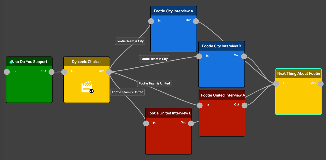
The result of this is that the Dynamic Choices Element above shows the City Choices to City fans, and the United Choices to United fans:
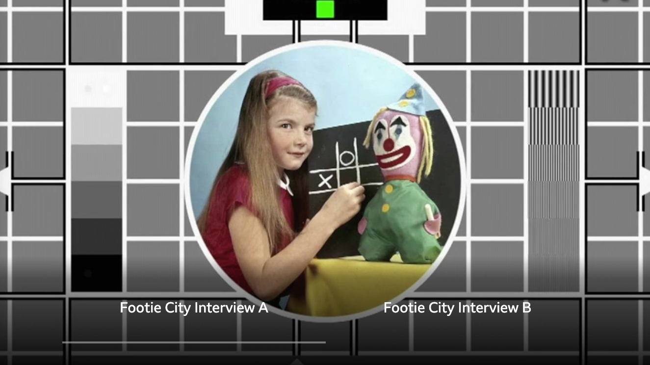
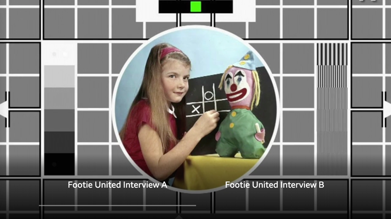
Footy City Choices, or Footy United Choices… two different Choices from the same Element.
Another powerful use of Link Choices with Conditions can be achieved using the built in Visited variable. Using Visited, a number of Choices can be presented to the viewer based on what they’ve already seen.
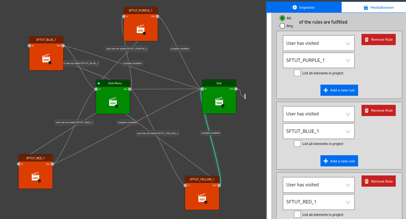
In the above Story, the viewer is taken from Start to HUB.
HUB has a Choice user interaction added, so it will display choices for Item 1, Item 2 and Item 3. All the Item Elements are linked back to HUB.
However, the links to Items 1, 2 and 3 each have a Condition added - ‘user has not visited Item 1’, ‘user has not visited Item 2’, and ‘user has not visited Item 3’, respectively.
Because of this, once an item has been chosen and seen, HUB will not offer the choice to see that item again, as the Link condition “user has not visited Item” will fail. So the viewer will see one less Choice every time they return to the hub.
Also shown in this Story is an Exit element. Here, Link Choices with Conditions have been used to show the viewer the Exit choice only when all three items have been seen. You can see this complex condition being authored in the Inspector in the screenshot above.
If you have the appropriate experimental feature enabled (i.e, you have set yourself up as an “expert”) you will be able to author conditions that reference elements outside your story. This is likely to be used where you have built a story composed of several sub-stories, and you want to author a condition in one substory that is dependant on which nodes the user visited in one of the other substories. The feature required for this is Use Other Elements in Visited Conditions.
With this enabled you will be able to author a condition on element A that evaluates whether the user has visited an element B in another story. In element A and author the condition. If you check the tick box “List all elements in project” the dropdown list of elements will include all elements in all stories in your project. Note that it can take some time to populate the list of all elements, during which you will see “no options” displayed.
Take care to select the correct element when doing this as using the wrong one will lead to the condition always evaluating as FALSE.
This is a feature that will only show in StoryFormer if you’ve enabled it using Enabled Features.
This feature allows you to apply audio and/or visual fades when starting/ending a representation. It allows you, for example, to fade from black into the video over the first 2 seconds, then to fade back out at the end. Similarly you can fade the audio in from silence and back out to silence.
To add a Fade to your representation, expand the Fade In/Out section of the Representation tab:
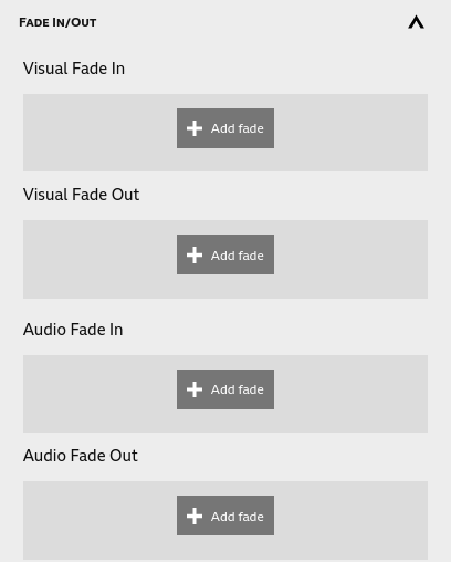
Clicking on one of these will allow you to add a fade. You will be presented with a popup and will need to set the following options:
Visual Fade Out: as with the fade in, but you will need to set an onset time. This is the time at which the fade starts. 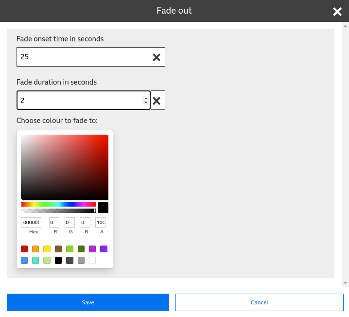
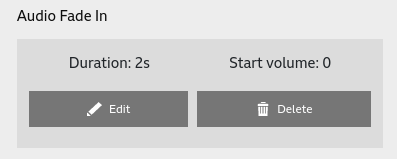
Audio Fade Out: onset time: the time at which fade out starts; duration: the time it takes for the fade to complete; target volume: the volume after the fade (default is 0). The foreground audio will fade from whatever the user has set to the target volume. 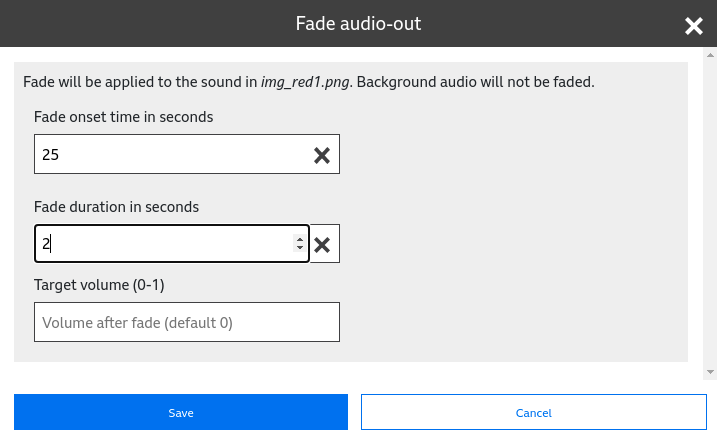
Once set you will see your fades in the Fade In/Out section, where you can edit or delete them.
For fade out behaviours, it is necessary to set both a fade onset time and a duration. The onset is the time at which the fade starts and the duration is the time it takes to complete. It is anticipated that this will be authored so that the fade finishes as the representation finishes, e.g., with a 27s video the fade will commence at 25s and have a duration of 2s. If the fade out finishes before the representation is complete the representation will remain in the faded state (e.g., black or silent) until the representation completes.
Audio fades are not applied to background audio, only the audio embedded in the video or (in the case of an audio only representation) the main audio. The ability to set a target volume and an initial volume could allow you to partially fade out (e.g., to quieten but not silence) the audio, and then in again over a transition between two elements.
Visual fades can be applied to images as well as videos.
This is a feature that will only show in StoryFormer if you’ve enabled it using Enabled Features.
Chapter Icons are useful if you are constructing an entirely linear story - like, for example, a simple step-by-step tutorial. Viewers can click on Chapter Icons to skip to any Element in your Story instantly.
Chapter Icons are only displayed for linear stories, such as this one:
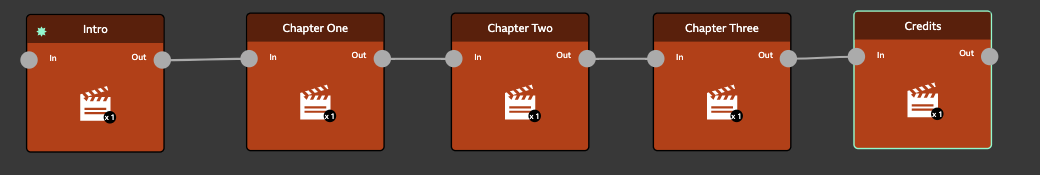
If there’s more than one way through your story, it’s not linear. If you set Chapter Icons on a non-linear story, StoryPlayer will not show them.
Chapter Icons have two states - Default and Active - and a different image can be shown for each state. The Active image is shown when that chapter is playing back, otherwise the Default state is shown.
Chapter Icons are set in Representation tabs. Click Add Icon on Default and Active to choose the images you’d like to use for Chapter Icons.
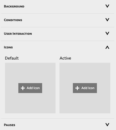
Once added, Chapter Icons can be replaced and deleted using the buttons beneath the icon.
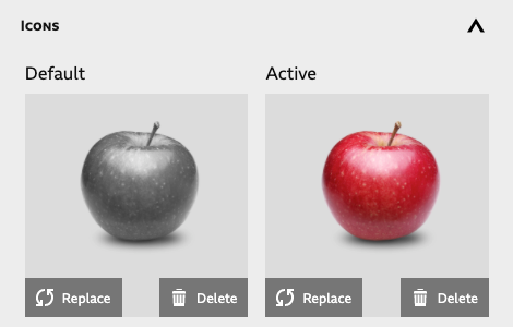
Chapter Icons can be seen and interacted with in StoryPlayer’s Transport Bar. Select the Icon Button to see them.

The video above shows three Chapter Icons in their Default and Active states, as the player moves through three short elements. The viewer can click on these Icons to instantly jump to the corresponding Element in your Story.
StoryFormer Stories can include other Stories. This is useful for two reasons.
It can stop your Story becoming unwieldy. Rather than having one large Story, with a lot of Elements on the canvas, it may make sense to break that Story up into multiple Stories, and link them together in a master or parent Story.
It allows multiple users to work on different parts of a Story at once. StoryFormer only allows one person to edit a Story at any one time. Breaking up a monolithic Story into multiple Stories gets round this limitation - each ‘substory’ can be worked on simultaneously.
To include a Story in an existing Story, click the Add Story button on the left of the canvas. This will launch the Add Story popup. Here, you can choose to add an existing story from the Project that you are working in, or create a new Story in the project, and include it.
Once you’ve added your Story, it will appear on the canvas with your existing Elements. You can treat it exactly like any other Element on the graph. It will appear squatter than a full Element, to remind you it’s another Story.
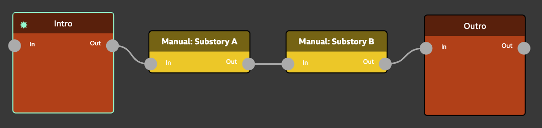
Consider the image above. When StoryPlayer moves from Intro to Substory A, it will start at the Beginning of Substory A. It will move through Substory A until it reaches an end, then return to the ‘master’ Story above. It’ll immediately move into Substory B until it reaches an end, then return to play Outro in the master story.
Selecting a Story on the canvas will show a handy Edit button. Click this, and you’ll be taken into the Story, where you can edit or review the contents. Use your browser’s Back button to return you to the Story you came from.
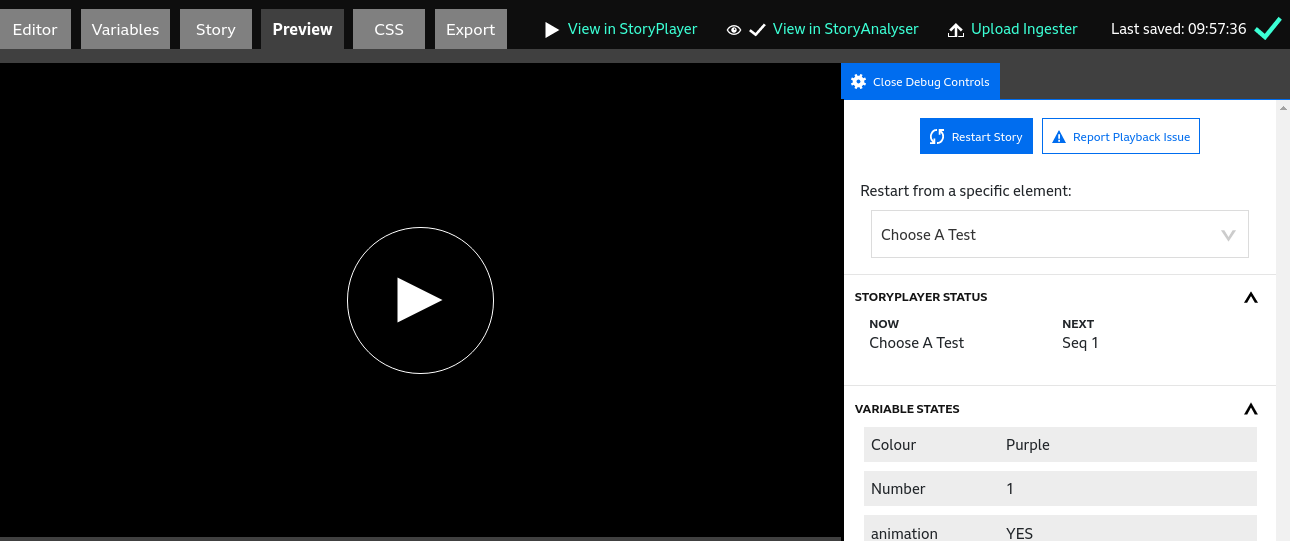
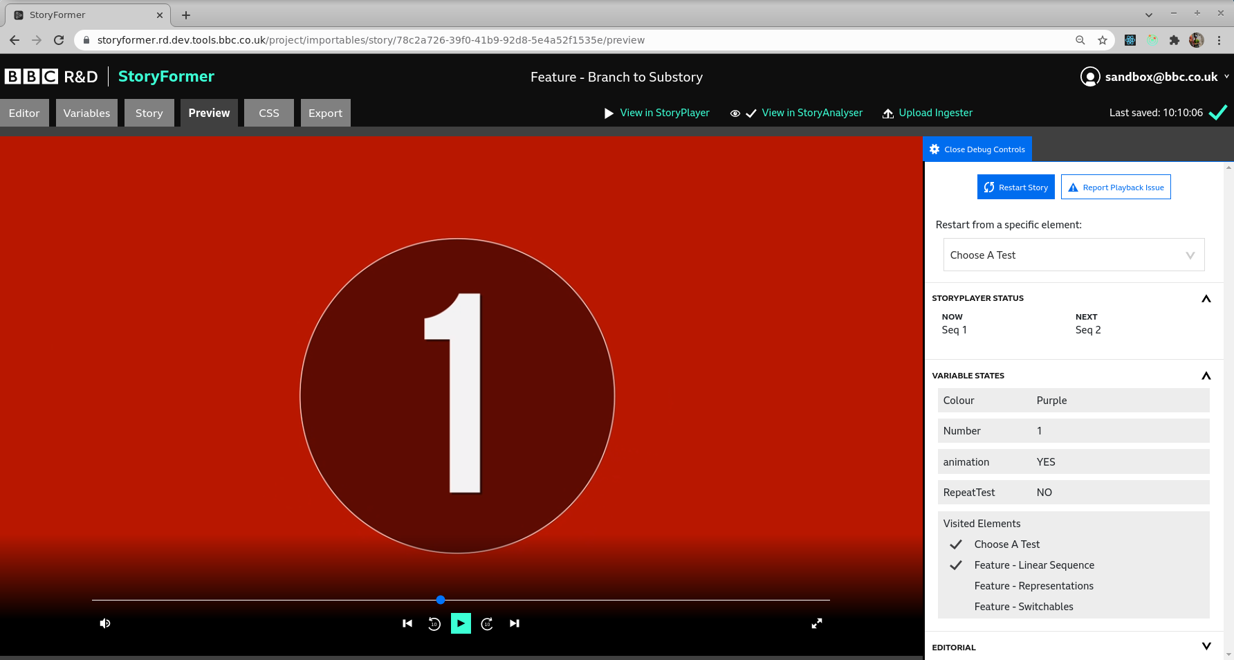
The Preview tab is where you can play and interact with your Story as you are creating it. The playback window is on the left - start your Story by clicking the Play icon.
If you hover over the lower portion during playback, you’ll see StoryPlayer’s transport bar. Going from left to right:
The behaviour of Seek Forward and Next is restricted by Choices and Variables Panels.
In an Element containing a Representation with a Choice, it is only possible to seek forward to the point where the Choice is shown. Similarly, the Next button will skip through Elements, but not allow the viewer to skip past an Element with a Choice.
Variable Panels also cannot be skipped using either Seek Forward or Next.
The behaviour of Seek Back and Back buttons is unrestricted. It is possible for the user to skip back and redo a Choice or a Variable Panel.
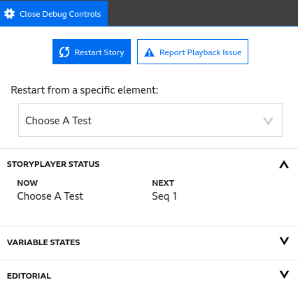
On the right hand side of the Preview tab are the Debug Controls. In the top section:
Storyplayer Status shows the current Element, and the one StoryPlayer will play next, based on the current state of Variables and Choices.
Here you can see the state of all the variables and how they change while a Story is being previewed. This section also shows which elements have been visited.
This is a feature that will only show in StoryFormer if you’ve enabled it using Enabled Features.
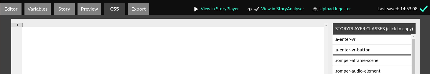
The CSS tab is an advanced feature that’s enabled through the Enabled Features menu. It allows the styling for certain StoryPlayer controls to be overridden. It has a CSS editing pane on the left, and a list of StoryPlayer classes on the right. These can be used for reference, and you can also click to copy a class name into the editor.
The CSS classes are currently undocumented. Feel free to experiment, but at this stage it is likely you’ll need support from the StoryFormer team if you feel the need to restyle StoryPlayer’s user interface. It’s always possible to get back to vanilla StoryPlayer styling by deleting everything you have added here.
This is a feature that will only show in StoryFormer if you’ve enabled it using Enabled Features.
If you want to share your story with others without having to publish it first, you can generate a share link by hitting the “Create Share Link” button. This will generate a unique and consistent URL for the given story and user. The validity of the link is valid for 14 days (the maximum) by default, but this value can be adjusted using the toggle buttons.
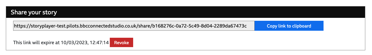
You can then select the “Copy Link to Clipboard” button to copy the URL in order to share it with others, without the need for them to log in.
If at any time you wish to revoke the link so that 3rd parties are no longer able to view the story, you can click the “Revoke” button.
If you reach the end of the validity period (default: 14 days) and you want to re-enable the link, revisit the Export tab and select the “Create Share Link” button again, and it will re-enable the link.
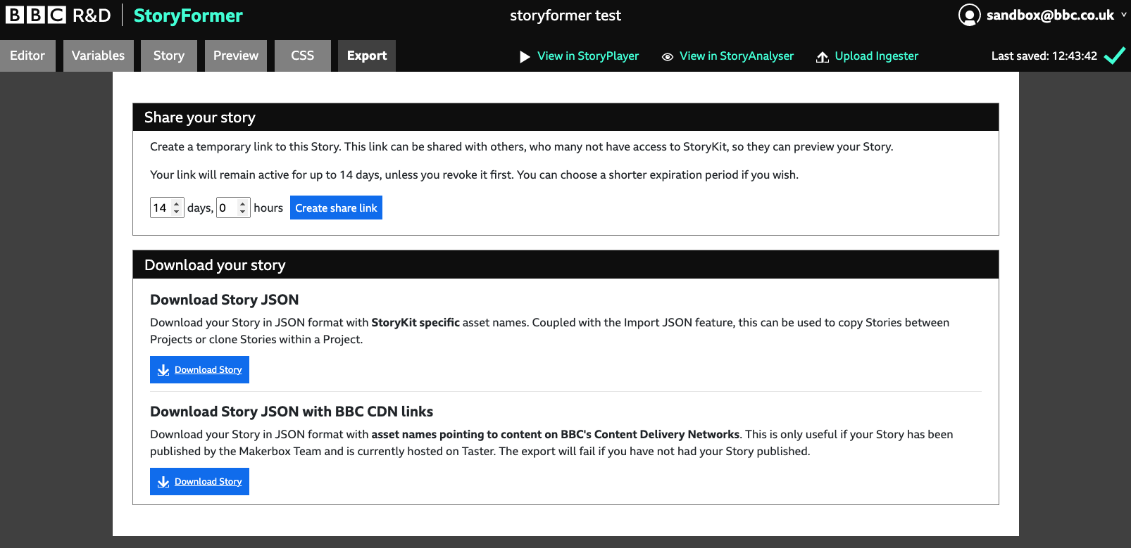
In the “Download your story” section of the Export tab you can download a JSON file representing your Story in one of two flavours.
Use this option to download your Story with StoryKit specific asset names. You can then use the Import JSON feature when creating a new story to copy Stories between Projects, or clone Stories within Projects.
This option is only relevant if your Story has been published to the BBC, and will download your Story with asset names pointing to content on the BBC’s CDNs.
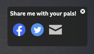
It’s possible to send a Tweet, a Facebook message or an email from your Story. This can be useful if you want your viewers to promote your Story themselves. For example, in a branching experience, you could add a Social panel to every ending.
To add a Social panel, in the Inspector, head to the User Interaction section for your Representation, and click on Add social panel.
You’ll be taken to the Add Social panel popup, where you can set the following:
Set the number of seconds into the Element you want your Panel to appear.
Set the title for the Social panel
The email, Facebook message or Tweet will be prepopulated with this text. The viewer will be able to edit it before sharing.
The URL that will be shared by the viewer. This should be set by you to point to a relevant URL. If you don’t specify a URL, it will default to link to the URL of your Story.
Set the Top, Left, Right, Bottom position that your panel will appear at, as well as the Width and Height. Or, leave them set to Automatic. There’s a preview of where your Panel will appear, so you can see as you adjust these settings.
Select which platforms you’d like the viewer to be able to share with (Facebook, Twitter, Email)
If you want to change the default styling of the panel, you can type the name of the CSS Class you’d like to use to style it here. You’ll need to have the CSS Tab enabled in Enabled Features to do this.
Once you’re happy with the settings, click Add to close the popup. To further edit your popup, you’ll find Edit and Delete buttons back in the Inspector
Preview your Story to check the Social panel out.
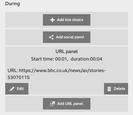
Using Add URL panel, you can offer one or more web page links to the viewer during playback of an Element. You can control when and where the URL panel appears, as well as how it’s presented and how long it stays on screen for.
Select the Element and Representation you want to add an external link to, then click ‘Add URL panel. This will launch the Add URL panel popup. There’s a number of options you can set here:
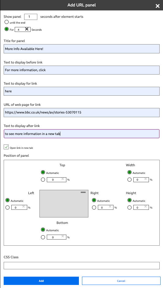
Set this to the number of seconds delay you’d like before the panel is presented. There are two options for setting duration - check Until the end if you want the panel to stay around until the next element, or set For [x] seconds to specify the duration yourself.
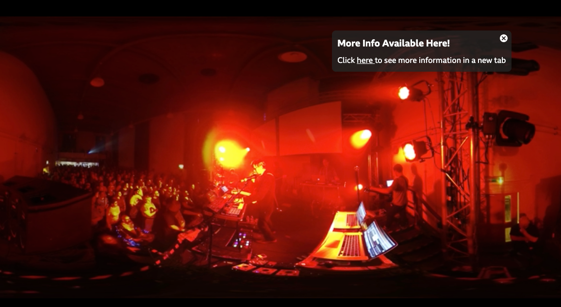
This title will be shown in bold at the top of the panel - in the above screenshot, it’s set to “More Info Available Here!”
Text to be shown before the link - in the above screenshot, it’s set to “Click”
The text for the URL itself - this will be clickable. In the above screenshot, it’s set to “here”
Set this to the address of the webpage that will be opened in the user’s browser when they click the URL.
The text after the link itself. In the above screenshot, it’s set to “to see more information in a new tab”
By default, URL panels will open the link in a new browser tab. This is probably the behaviour that you want. Unchecking this will result in the user being directed away from the story, as the StoryPlayer page they are on will be replaced with the webpage specified in the URL panel.
Use this interface to specify the position and size of the URL panel.
If you want to change the default styling of the URL panel, you can type the name of the CSS Class you’d like to use to style it here. You’ll need to have the CSS Tab enabled in Enabled Features to do this.
Once you’ve specified your URL panel, click Save Changes. To further edit or delete your URL panel, return to During behaviours, where you’ll find edit and delete buttons. You can also create additional URL panels to be shown during your element by clicking Add URL panel again.
Using Add Text Ovelay, you can display one or more pieces of text during playback of an Element. You can control when and where thetext appears, as well as how it’s presented and how long it stays on screen for.
Select the Element and Representation you want to add the overlay to, then click ‘Add Text Overlay’. This will launch the Add Text Overlay popup. There’s a number of options you can set here. Many of these are common to the previous options:
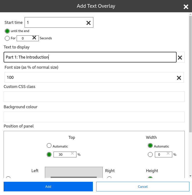
Set this to the number of seconds delay you’d like before the text is presented. There are two options for setting duration - check Until the end if you want the panel to stay around until the next element, or set For [x] seconds to specify the duration yourself.
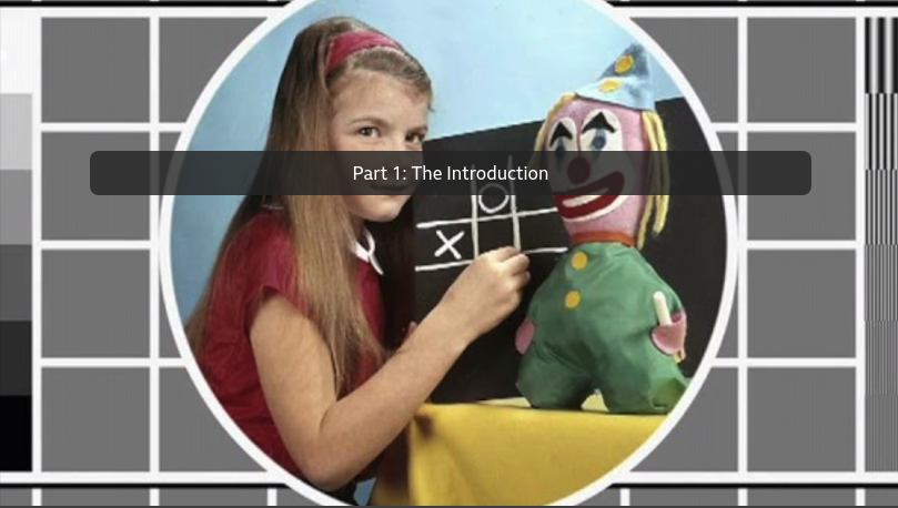
The text to be shown - in the above screenshot, it’s set to “Part 1: The Introduction”. This text can include html tags; combined with the css class (see below) and the CSS editor this can allow more sophisticated overlays.
Specify the size of the text. This is relative, defined as a percentage of normal size (e.g., link choice text) - greater than 100% is larger, less is smaller.
Specify the background to the text using HTML valid text. The default is a transparent grey (see above).
Use this interface to specify the position and size of the Text Overlay.
If you want to change the default styling of the text overlay, you can type the name of the CSS Class you’d like to use to style it here. You’ll need to have the CSS Tab enabled in Enabled Features to do this.
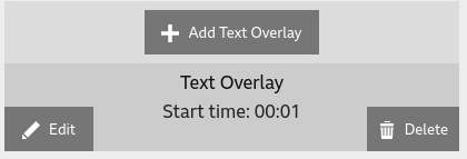
Once you’ve specified your Text Overlay, click Save Changes. To further edit or delete your Text Overlay, return to During behaviours, where you’ll find edit and delete buttons. You can also create additional Text Overlays to be shown during your element by clicking Add Text Overlay again.
This is a feature that will only show in StoryFormer if you’ve enabled it using Enabled Features.
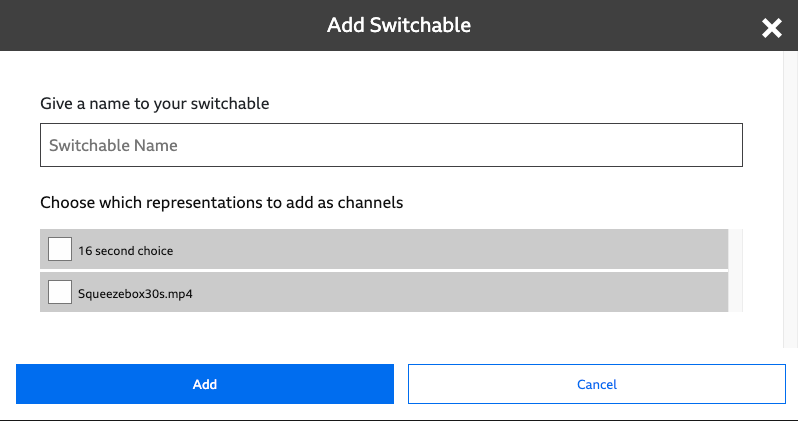
A Switchable is a collection of Representations that start playing simultaneously. To distinguish Representations in Switchables from regular Representations, we call them Channels. Much like live TV, it’s only possible to watch one Channel at once. The viewer is able to flick back and forth between different Channels whenever they choose. This is useful if you’ve filmed something on multiple cameras simultaneously, and want the viewer to be able to choose which camera to view the action from.
To create a Switchable, add one or more Representations to an Element, and click the Add Switchable button in the Media section of the Inspector. This will show the Add Switchable popup, in which you can name your Switchable, and choose which Representations to add as Channels.
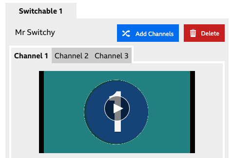
Once you’ve added the Switchable, you’ll see it in the Inspector. Next to the name of your Switchable is an ‘Add Channels’ button, which can be used to add additional Channels, and a Delete button, which will delete the entire Switchable from your Element.
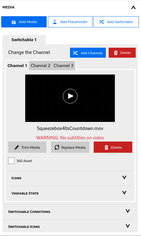
Once you have created your Switchable, you will notice that there are different options available to normal Representations. For the Channel you are limited to setting icons (which determine how the channel is presented to the user; see below) or having a variable manipulation behaviour applied. You cannot apply Pause behaviours, have User Interactions, or set conditions that determine if a Channel is available. For the Switchable as a whole, however, you can set conditions that determine when it is valid. You can also set icons that might be used as chapter icons.
The viewer will switch channels by clicking on an Icon that represents that channel. To set the icon for a channel, hit the Add Icon button for the Default icon, and pick your image from the MediaBrowser. Any image set for the Active icon will be ignored.
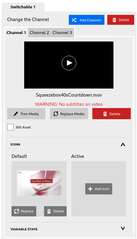
The Active Icon will be ignored.
You’ll want to assign a Channel Icon for every channel you have.
To check out your channels, go to the Preview tab and play your experience. In Elements with Channels, you will see a Channel Change icon in StoryPlayer’s Transport Bar. Click on this to reveal the channels, and click on the icon you assigned to each channel to switch to it.
The Story Tab allows you to set various Story-wide settings.
Unhappy with your Story name or description? Edit them here. Descriptions are shown when selecting a story (e.g., when when you load StoryFormer)
This is a feature that will only show in StoryFormer if you’ve enabled it using Enabled Features.
Either type a custom aspect ratio for your assets in here, or use the selector to choose from a number of handy defaults. If, for example, you want a portrait experience, you’ll need to set this.
Your story will be rendered in a container that has this aspect ratio. Media that doesn’t conform to this ratio will show black bars at the top and bottom, or at the sides.
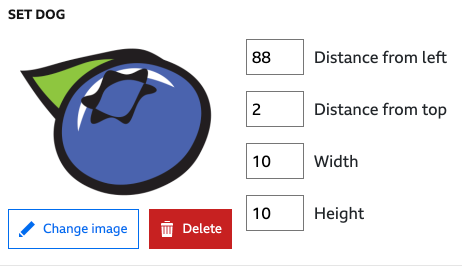
DOG is an abbreviation for Digital On-screen Graphic. It’s a bit of broadcast terminology for the channel ident watermark often seen on broadcast channels.
|
|
|
Your DOG will be shown throughout the entire story. If you want a transparent DOG, use an image format that supports transparency, and set the transparency level in the image itself.
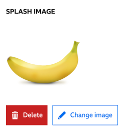
Before your viewers start playback of your Story, they’ll see the Splash Image behind the play button. Click Select an image, choose your image. Your choice will be shown, as well as options to Delete or Change Image.
|
|
|
Checking this option will allow your viewers to return to your Story and continue where they left off.
Sets the title that will be shown in the browser for the published version of your Story.
If you’re publishing an experience, these tags will be set as by you, the MakerBox and the StoryFormer team in the run up to making your experience live. If you’re not publishing to BBC Taster or elsewhere on the BBC website, these can be safely ignored.
If you’re publishing an experience to Taster, these will be used by the Taster team to set properties of the Taster Badge.
If you’re publishing an experience to Taster, it can be geolocked to UK, or Worldwide excluding UK.
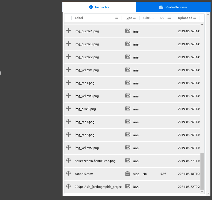
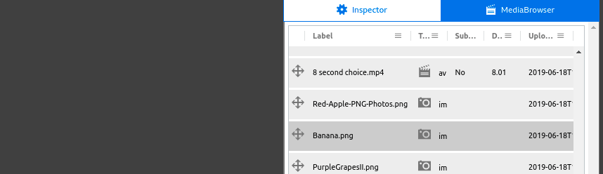
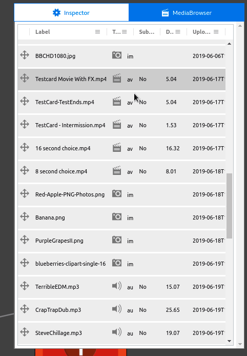
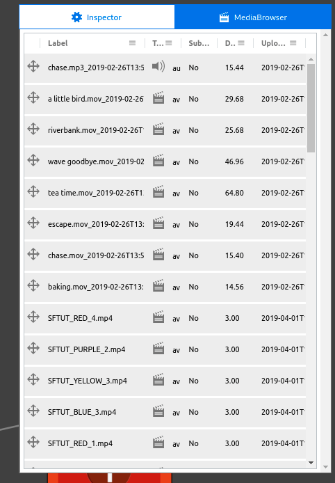
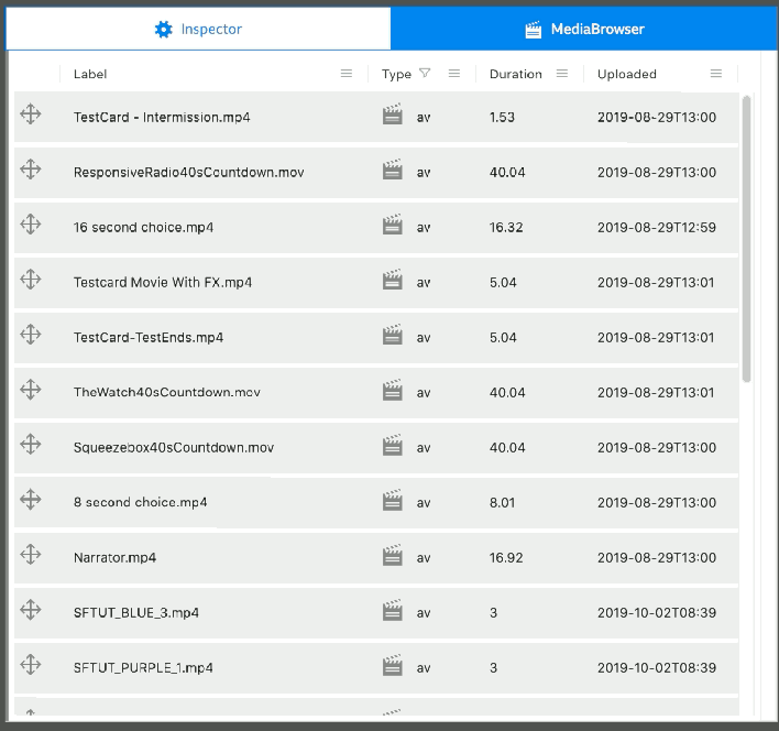
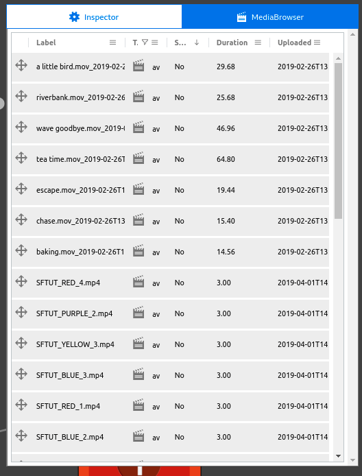
The Media Browser and the Inspector share the same panel. Click on the MediaBrowser tab at the top of the panel to select it. Click on the Inspector tab to return to the Inspector view. All of the media you’ve ingested to your Project will be visible here, with attributes shown in columns.
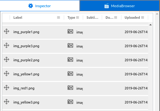
Label - the filename of the asset
Type - AV (Video), Image, Audio
Subtitles - Yes/No showing whether or not an AV asset has subtitles (this column is blank for non AV assets)
Duration - Duration of audio or video, in seconds
Uploaded - the time and date the asset was uploaded
As noted above, the Inspector/Media Browser panel can be resized by dragging the left border.
You can create an Element by dragging media from the Media Browser. With the Media Browser open, click and drag the media you want to use in the Element, and drop it on the Canvas. An Element will be created for you, with a Representation holding the media you dragged.
The drag and drop process can be repeated to add additional Representations to your Element.
Preview Media by clicking anywhere in a row. The bottom portion of the Media Browser will change to show a preview of the content. Time based media can be played by clicking the play button in the preview.
If there is a lot of media in a project, it may be useful to filter it. To do so, click on the three line ‘hamburger’ menu at the top of the column you want to filter. A small Filter menu will appear.
By default, the filter type is set to ‘Contains’. There are other filter types available which may be more convenient for other columns, but ‘Contains’ is useful if you’re after a piece of media with a particular name.
To find Labels containing a particular search term, click on the hamburger menu in the Label column, and type your term into the box marked Filter. The MediaBrowser will be filtered by the term you entered. Here, I’m searching for everything with ‘blue’ in the Label:
Any filtered columns have a filter icon against them:
The Clear Filter button in the Filter menu will clear any filters you have applied to the column. Filtering options will remain while you have the MediaBrowser tab open, but are cleared when you switch to the Inspector.
Sort the entire MediaBrowser by clicking on Label, Type, Duration or Uploaded. Repeated clicking will cycle through ascending, descending and the default ordering - indicated by the presence of an up arrow, down arrow, or the absence of an arrow.
If you want to reorder the columns, just click and drag the column heading left or right. The Media Browser will show you what will happen when you drop your column, so when your column is in the right place, drop it.
Here are some simple rules that will help you use Background Audio effectively.
Background Audio will play when your Representation is played. Once your Element’s Representation has finished, StoryPlayer will move on to the next Element, and play a Representation from that element. At that point, the Background Audio can either be continued, stopped, or changed.
If the next Representation has the same Background Audio selected as the previous Representation, the background audio from the previous Representation will continue playing uninterrupted. This allows you to continue background audio through as many Elements as you like.
If the next Representation has a different piece of Background Audio, the previous Background Audio will be faded out and stopped, and the new one started.
If the next Representation has no Background Audio, StoryPlayer will fade out and stop the current Background Audio.
StoryPlayer automatically loops all Background Audio, and continues to play it when the Story is paused by the viewer. If you don’t have a clean loop, someone will hear this.
A number of features within StoryFormer can be enabled and disabled. To access them, click on your login information in the top right of StoryFormer, and choose Change Enabled Features.
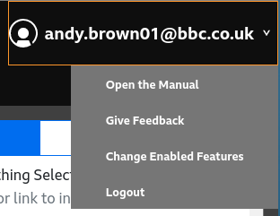
You’ll be presented with the Enabled Features menu. There are a number of preset Feature Profiles here that you can choose from the selector at the top - Simple, Complex and Expert. These enable and disable sets of features for you.
Simple clears all Enabled Features, giving you the most streamlined authoring experience, and if you’re getting to grips with StoryFormer, this is where you’ll start. Choosing Complex or Expert will automatically expand the menu to show which features are enabled under these Feature Profiles.
Regardless of which profile you choose, the sections of the menu can be expanded manually using the V and inverted V controls to show all of the feature toggles.
The Profiles are just a starting point - you are able to turn on and off any combination of features. If you’ve done this, the Feature Profile selector will be greyed out, and show Custom.
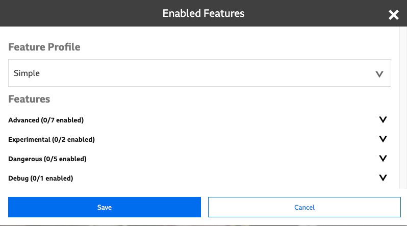
Get the shades on. You’ve got to grips with the basics, now it’s time to level up. All Advanced features are fully supported by StoryFormer and StoryPlayer.
Allows chapter icons to be set for each Element. These are only used when a Story is an entirely linear sequence of Elements.
Enables a custom aspect ratio to be entered.
Shows the Export Tab and shows Import options when creating a new Story. Allows Stories to be exported and imported to and from JSON files.
Enables Link Ranking in the Inspector. StoryPlayer evaluates each Link’s Conditions in the order they are ranked, and takes the first Link with a Condition that evaluates to True.
Allow setting various parameters required to publish an experience to BBC Taster.
Enables Representation Ranking in the Inspector. StoryPlayer evaluates each Representation’s Conditions in the order they are ranked, and shows the first Representation with a Condition that evaluates to true.
Advanced not edgy enough for you? Get your fingers lightly singed with some experimental features. These features are unfinished or in development, and are likely to not be fully supported.
Enables 360 video and image support. Not fully tested. Stories containing 360 content cannot currently be published to BBC Taster.
Enables clips to be trimmed in length. We recommend that this is only used during Story development. It’s better to trim clips in your favourite editor and reupload them, as trimmed clips can cause problems for StoryPlayer on some platforms. This position may be reevaluated as we develop StoryPlayer further.
Allows the creation of Conditions using Visited that reference Elements from other Stories in your project.
Living on the edge stuff! Enter at your own risk, and with great knowledge. Features in here will be useful to you if handled correctly, but could break your Story if fumbled.
Enables the CSS Tab for restyling user interface elements presented by StoryPlayer. Changing CSS is an easy way to break the functionality of your Story.
Element UUIDs can be manually entered or copied into a text box in the Debug pane of the Preview tab. All UUIDs entered will be considered Visited.
Allow variables to be imported from another Story. Makes a copy of imported Variables in the current Story. The variables in the two stories are not linked. Extreme caution advised - making any changes to these variables after importing (like adding an item to a list) will cause problems.
Enables Switchables. Switchables allow multiple Representations to be played coincidentally, with the viewer able to flick between each one. Good for different camera angles shot at the same time. We used it in our Origami Frog pilot. Performance of using Switchables can be poor for the audience.
Here you can find Features relating to the Debug panel in the Previewer.
Show UUIDs for Stories, Elements, Representations, Asset Collections, User and Media.
The Upload Ingester tool enables you to upload your media to Projects, and manage media you’ve already uploaded. It’s an independent tool from StoryFormer and can be accessed directly in your browser by visiting https://upload.rd.live.tools.bbc.co.uk/. There’s a handy link to it in the StoryFormer tool next to the various tabs (Editor, Preview, etc).
With respect to the craft editing of video and audio assets, it’s best to consider StoryFormer as a post-production tool that you bring curated, prepared assets into. Once you’ve added an individual asset to StoryFormer, the only editing that’s possible is to trim the in and out points for it. You will not be able to take one clip and split it into two separate clips, or vice versa.
This means you’ll want to have cut your media into appropriate chunks of story before you upload it into your Project, which will require some planning on your part. You will need to organise your source material into separate clips, where each clip contains an individual piece of narrative.
What these narrative boundaries are is entirely up to you - they could be shots, sequences of shots, or scenes. They are as long or as short as you want them to be. If you intend to trim or adjust in and out points within StoryFormer, our recommendation is that you keep clips to under 180 seconds in length. Accurately adjusting in and out points for clips over this length may get tricky.
Every individual asset you upload should be a piece of media that you don’t want to split down any further - each one should be an individual, indivisible piece of story with respect to the responsiveness and interactivity that you’re aiming to achieve.
We use AWS MediaConvert to perform our video and audio transcodes. The list of accepted input formats and containers are listed here.
General considerations regarding uploaded media:
Video
Images
Landscape and Portrait
By default each user has an upload quota of 2GB, which is about 3 hours. If you wish to get this raised, please contact MakerBox.
When you arrive at the Upload Ingester, you’ll see two tabs at the top - Upload and Uploaded Media. No matter which tab you’re using, the first action you need to take is specifying which Project you want to work with. Use Select Project to do this.
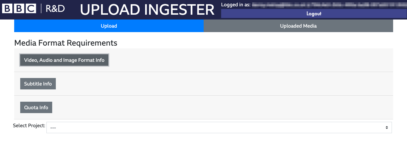
To upload media, ensure the Upload tab is selected, and select a Project to upload media to. To upload brand new media, select the “New Media” tab and click Browse to browse for media files to upload - this will bring up a file selection dialog. You can select multiple files to upload simultaneously (providing youre not also uploading subtitle files) - the precise method for doing this may depend on your operating system.
If you wish to upload a video or audio file with an accompanying subtitle file, select the second “Browse” button and select your subtitle file from the following file selection dialog.
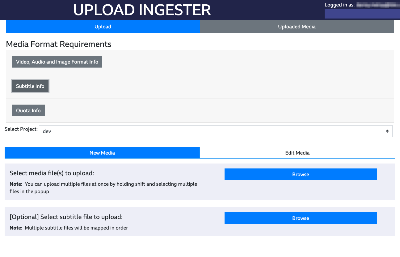
Once you’ve completed this, the Upload Ingester will list the selected files for you. Click Upload to start ingesting the files.
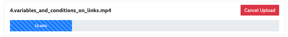
You’ll see a progress bar - if you realise you’ve made a mistake at this point, just click Cancel Upload.
If you want to replace an existing piece of media, for instance you needed to trim a piece of media or replace it entirely, or perhaps you wanted to upload new or reversioned subtitles, then click on the “Edit Media” sub tab.
Select the name of the piece of media you would like to edit from the drop down list and it will populate inside the page.
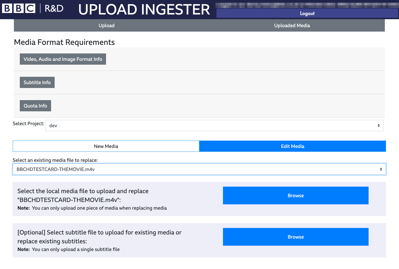
Then choose either (or both) of the following: - Upload a new piece of media to replace the existing piece of media by selecting the first “Browse” button. - Upload a new subtitle file to replace the existing subtitle file by selecting the second “Browse” button. Note: If a subtitle file did not already exist on the asset before adding it to a story, these pieces of media may need replacing within StoryFormer once subtitles have been added to the asset.
Then just click Upload to start ingesting the files as above.
That’s about it for the Upload tab. To follow the journey of your media into StoryFormer, you’ll need to switch to the Uploaded Media tab.
The Uploaded Media Tab shows you the status of all the media you’ve uploaded to a Project. Like the Upload Ingester, you’ll need to use Select Project to get to the Project you want to work in. If you’ve come from the Upload Tab, this should be set to the Project you’ve just been uploading media to.
When you upload content, the Upload Ingester stores an exact copy of what you’ve uploaded, and produces a new copy that’s transcoded to a suitable format for StoryFormer to work with.
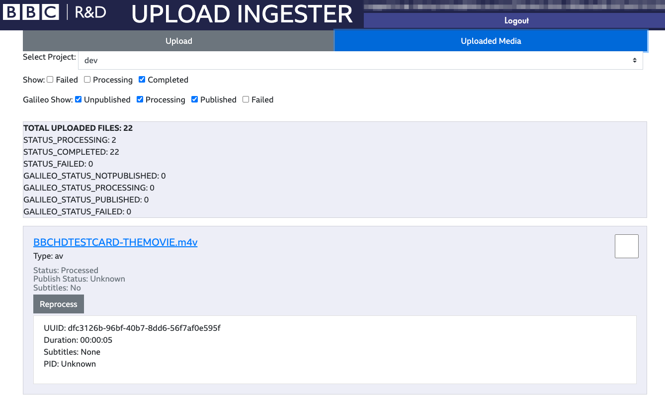
Below the Project selector are various filters that can be used to find the media you’re interested in. It’s likely that the only status you are interested in is Completed - this indicates the media is now available to StoryPlayer, and will appear next time you open the MediaBrowser. Click on the boxes next to Show to toggle:
Failed: Checking this will show media that have failed to be ingested. This status could indicate that there’s a problem with the media itself, or the cloud-based services StoryFormer relies on to operate. If trying again doesn’t work, you’ll want to contact the StoryFormer team.
Processing: Checking this will show media that are currently queued for transcoding.
Transcoding: Checking this will show media that are currently being transcoded. The Transcoding is the slowest part of the ingest process, and could take a long time for large files. Upload Ingester transcodes your media to web-safe formats that are lightweight enough to work with in a cloud-based tool, but retains the originals for publishing.
Completed: Completed media is available for use in your Project.
Equally there are further options available to filter the uploaded media items based on their Galileo (published) status.
WARNING: Removing media from a Project does not check for the use of this media in your stories. You should replace all media you plan to remove from your StoryFormer stories using the Replace Media button in the Inspector before removing media using the Upload Ingester.
If you do remove media that’s referenced, StoryFormer won’t be able to play back the media in the Preview tab, Inspector, or MediaBrowser. However, you can still use Replace Media to fix this after removing media from a project, if necessary.
To remove media from a project, select the checkbox to the right hand side of the piece of media you want to remove. This will enable the Remove from Project button - click this to remove your media and consign it to the digital black hole of the cloud.
We recommend that you start developing your idea in StoryFormer before acquiring your final content. You can make fully interactive StoryFormer experiences using only Placeholder Representations. Also, consider using other ‘proxy content’ - found images, photos or clips you’ve filmed on your phone - to develop your ideas. All assets can easily be replaced later with improved or final versions of the media.
If you’re creating non-linear and/or interactive content, you may find yourself missing shots you need if you film first and add responsiveness and interactivity second.
Working iteratively will help you plan out the shape and interactivity of your story, which in turn will help you decide what media you need to film to fulfill it.
Publishing your story currently requires the involvement of the StoryKit team. Our experiences have generally been hosted on BBC Taster. It will soon be possible to host your experiences in the BBC’s Standard Media Player.
StoryFormer has a built in link for you to see your stories as the audience do. If you wish to share your story with people who do not have access to StoryKit, you can use the Export tab to generate a time-limited link that you can send to anyone who needs to see the story.
Alternatively, if sharing a link is not sufficiently private, and if you need to allow a small number of known users to see your story as it develops (e.g. stakeholders) contact the MakerBox team.
It would be a great help to all StoryFormer users if you could report the problems you find whilst working with the tool. Please send an email summarising the problem, and if possible detailing how to reproduce it, to the following email address:
To use StoryFormer and the Upload Ingester, you’ll need a laptop or desktop machine running Google Chrome.
StoryPlayer stories are designed for the web - our supported playback platforms are desktop, tablet and mobile.
StoryPlayer stories cannot be hosted or launched on iPlayer, but a StoryPlayer SMP plugin is in progress.
Send an email to makerbox@bbc.co.uk.
If you run into issues using StoryFormer, or have any questions or enquiries not answered by this manual, please post your question on the MakerBox StoryFormer forum. We will endeavour to reply as soon as possible.
If you are a BBC employee and have access to Slack, we also monitor the channel #help-rd-storykit